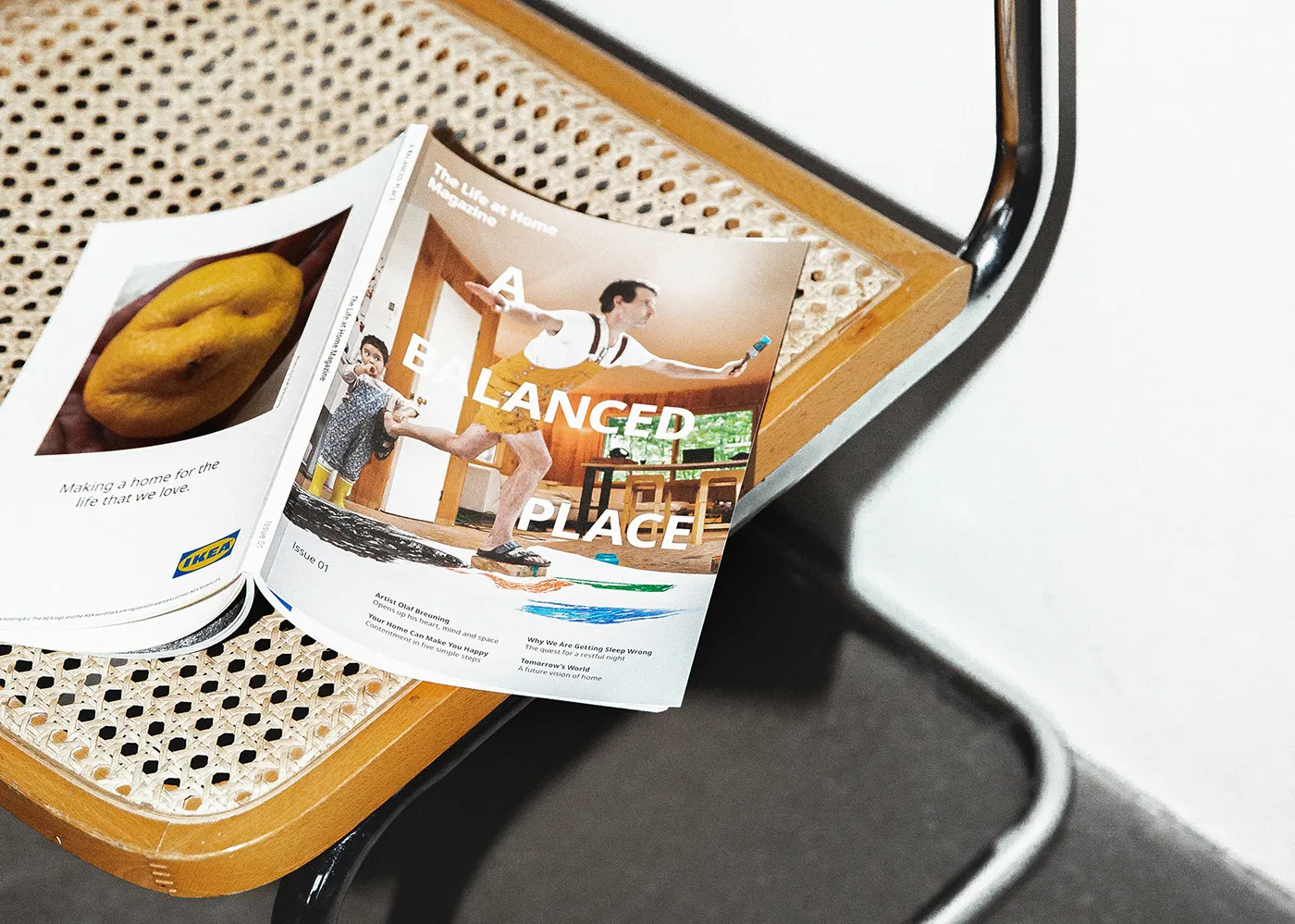
The first ever magazine for IKEA’s Life at Home Report.
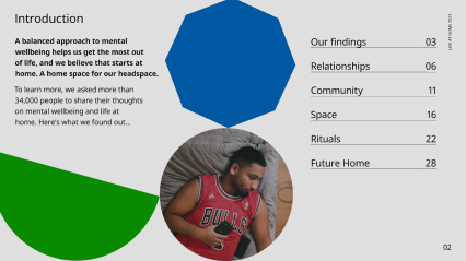
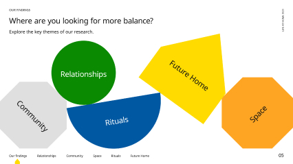
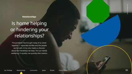
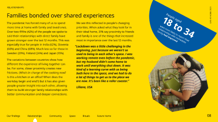
‘A Balanced Place’ is an experiment in format and content to make the Life at Home report insights more accessible. The original articles focus on real people and high profile collaborators to explore how our home space, rituals, relationships, community and the future home can support our mental wellbeing – the focus for this year’s study.


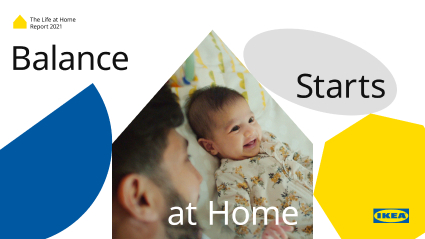
Underpinning the magazine design is a cast of shapes that represent the idea of balance, and our head space working in harmony with our physical space. Typography is set in IKEA’s Noto and used playfully to help communicate the theme. The whole design system stays true to IKEA’s brand and design philosophy, smart and accessible.

A pdf version of the report was also produced using the same design system, with the shapes balancing and interacting with participant photography to add tension and visual interest to the static format. Large format imagery and greater use of bold colour helped with the pace and flow of the document.