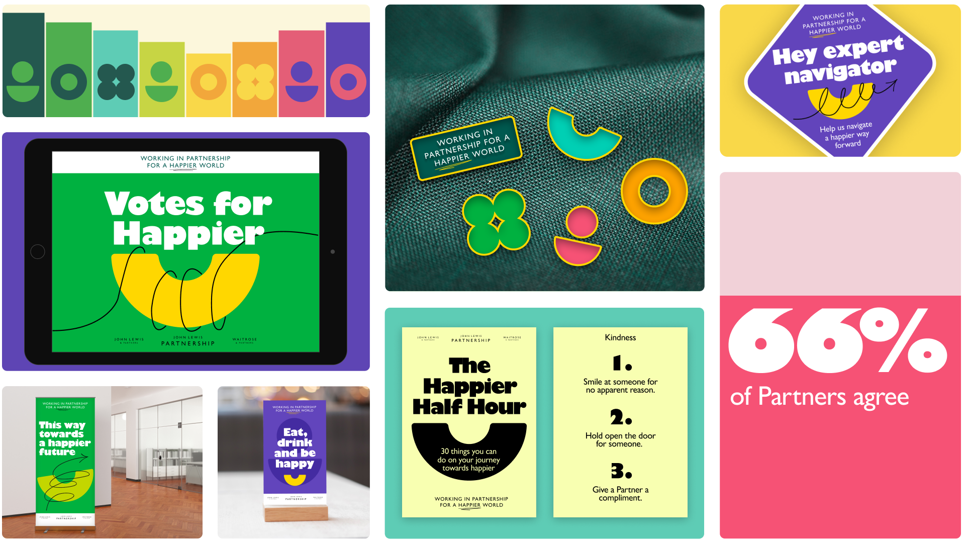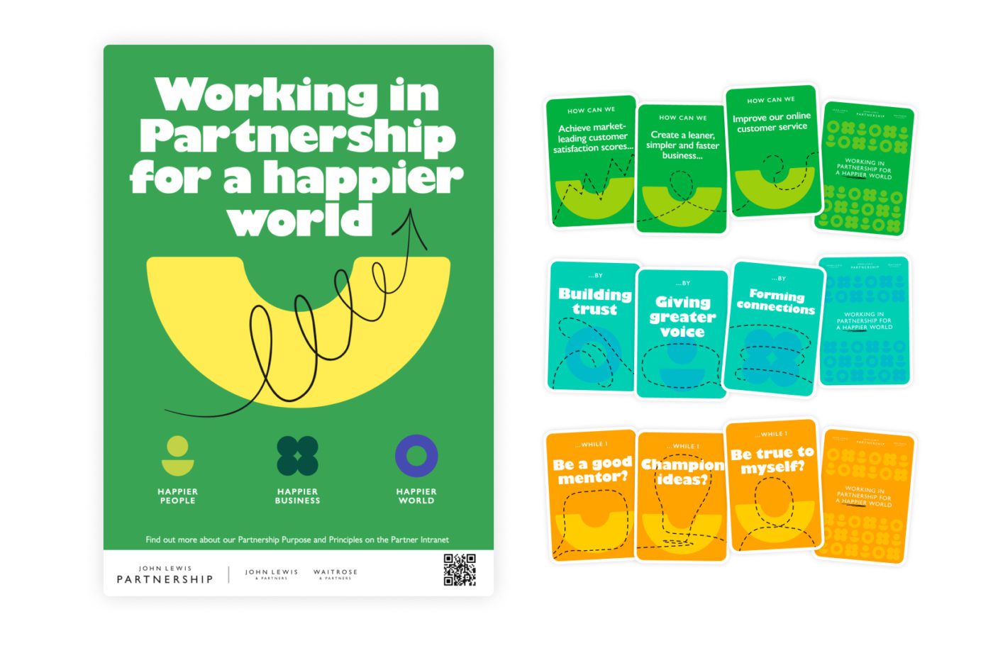
This project launched the John Lewis Partnership’s new Purpose to the business, to engage employees and give the Purpose a distinct visual language that would be easily recognisable and understandable to everyone.
The identity needed to feel familiar and respect the Partnership brand, but feel fresh and exciting to stand out from the usual internal communications. The project was co-created with an employee council, who could input at key moments and help guide the right direction.
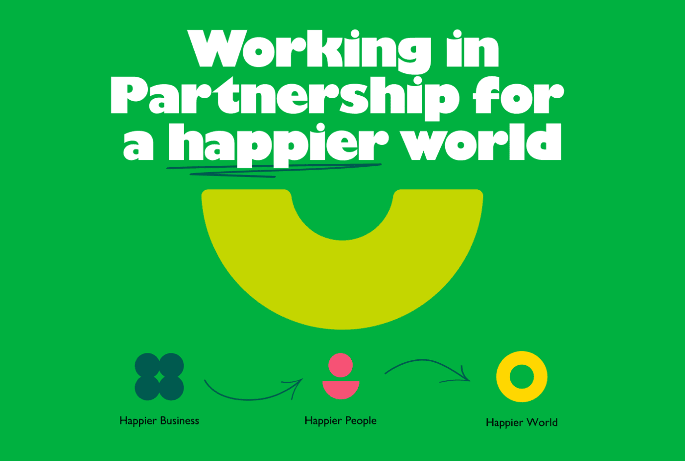
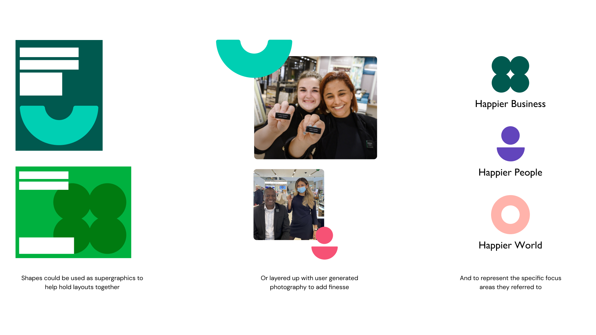
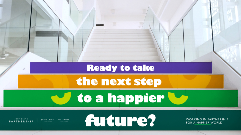
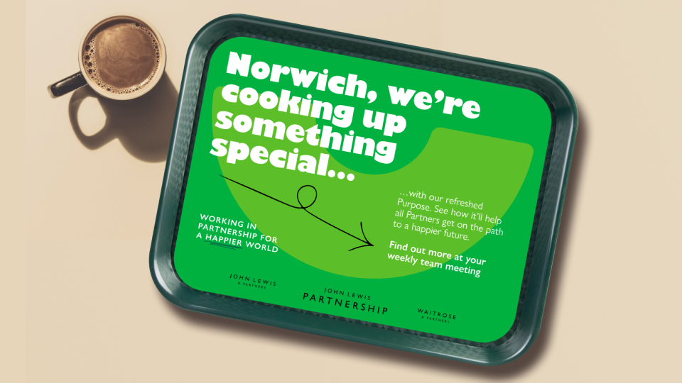
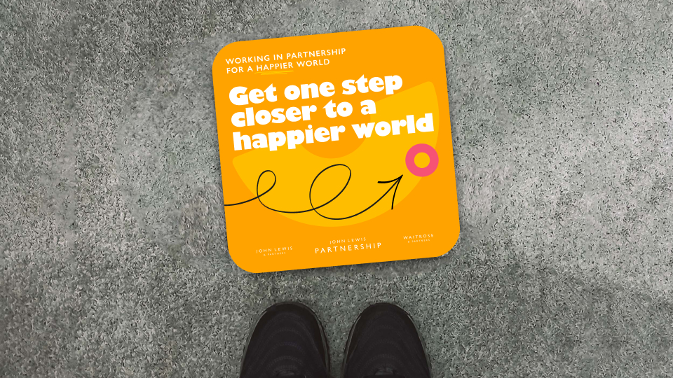
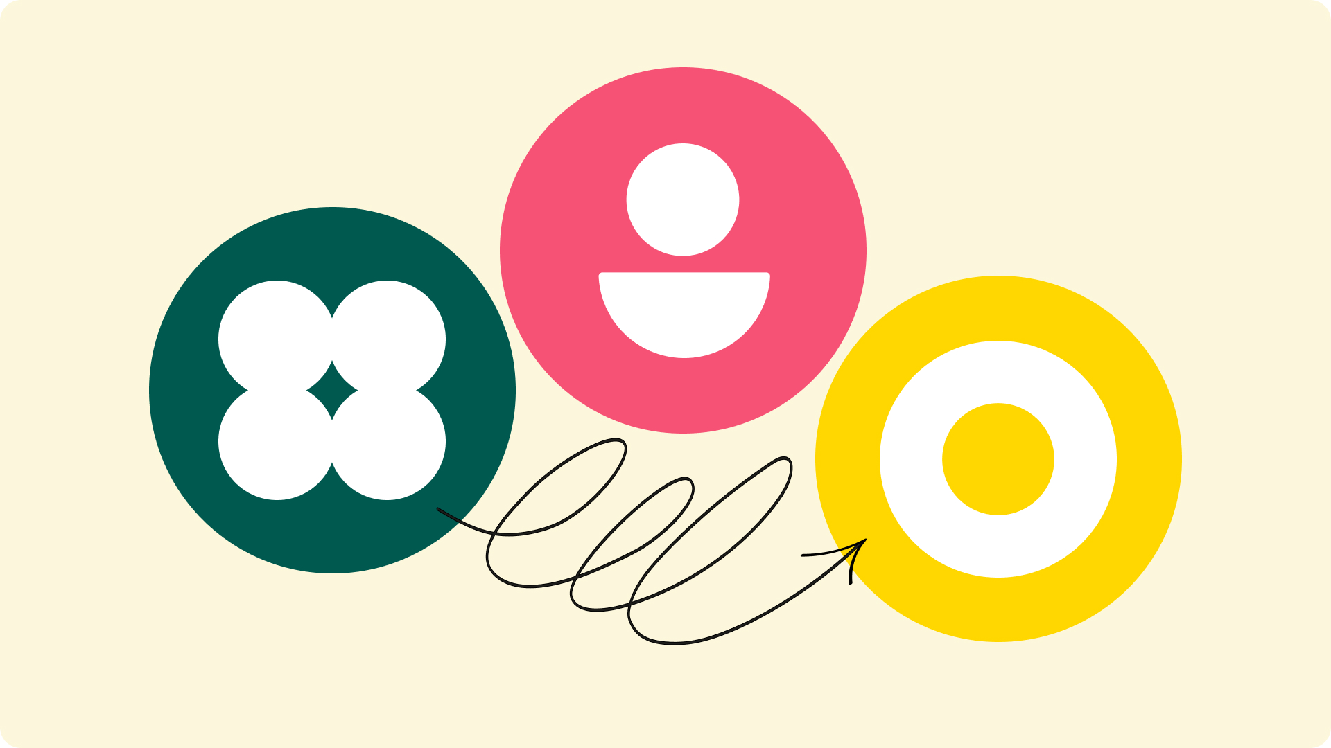
The work was centred around empowering Partners at JLP to finding a happier way of doing things, showing the milestones on the journey to being a better business.
A simple smile shape, hand drawn gestural elements and the Ultrabold weight of brand font (Gill Sans) combined to create an easy to understand visual language that felt uplifting and inclusive.