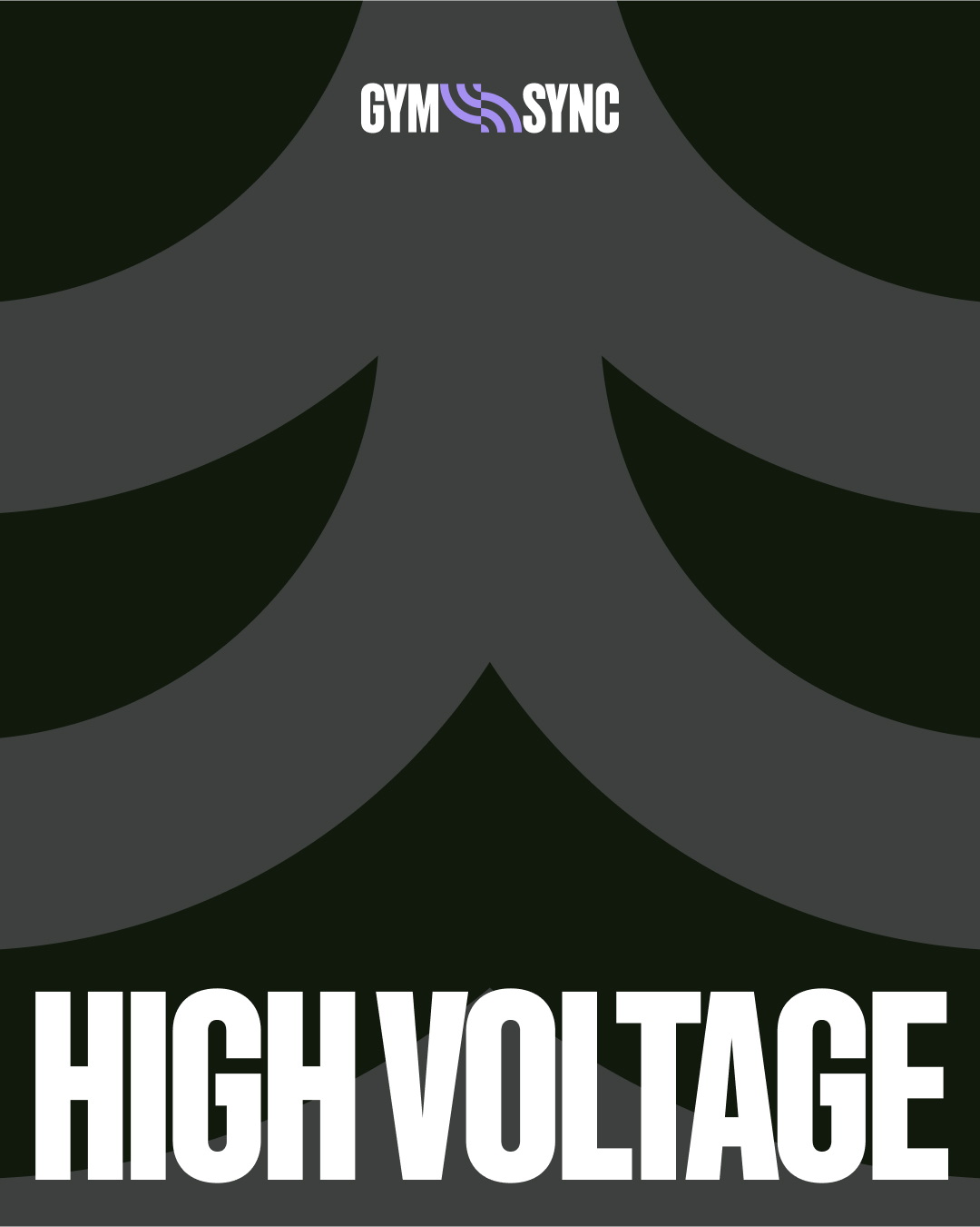
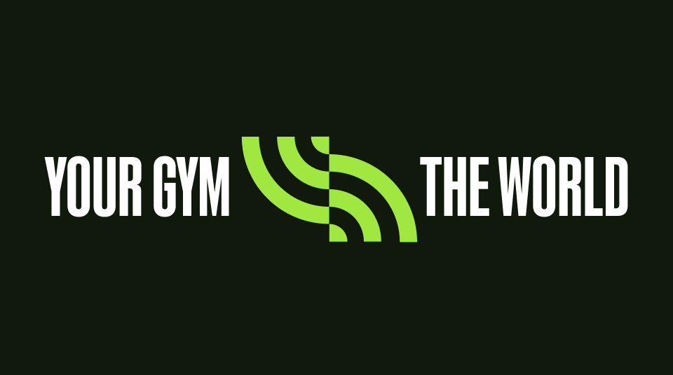
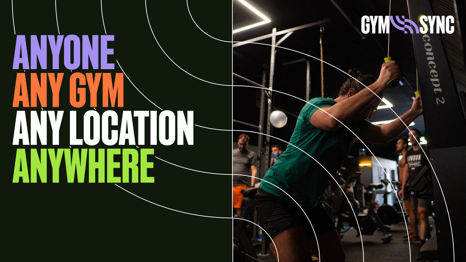
Designed to be inclusive & accessible for athletes of all abilities & access, GymSync is a new crossfit based competition that allows Gyms anywhere in the world to compete with each other from their respective locations.
Connecting the fitness & tech worlds the new brand had to be empowering & exciting to potential athletes while flexing to work for Gym partnerships & a more business focussed audience.
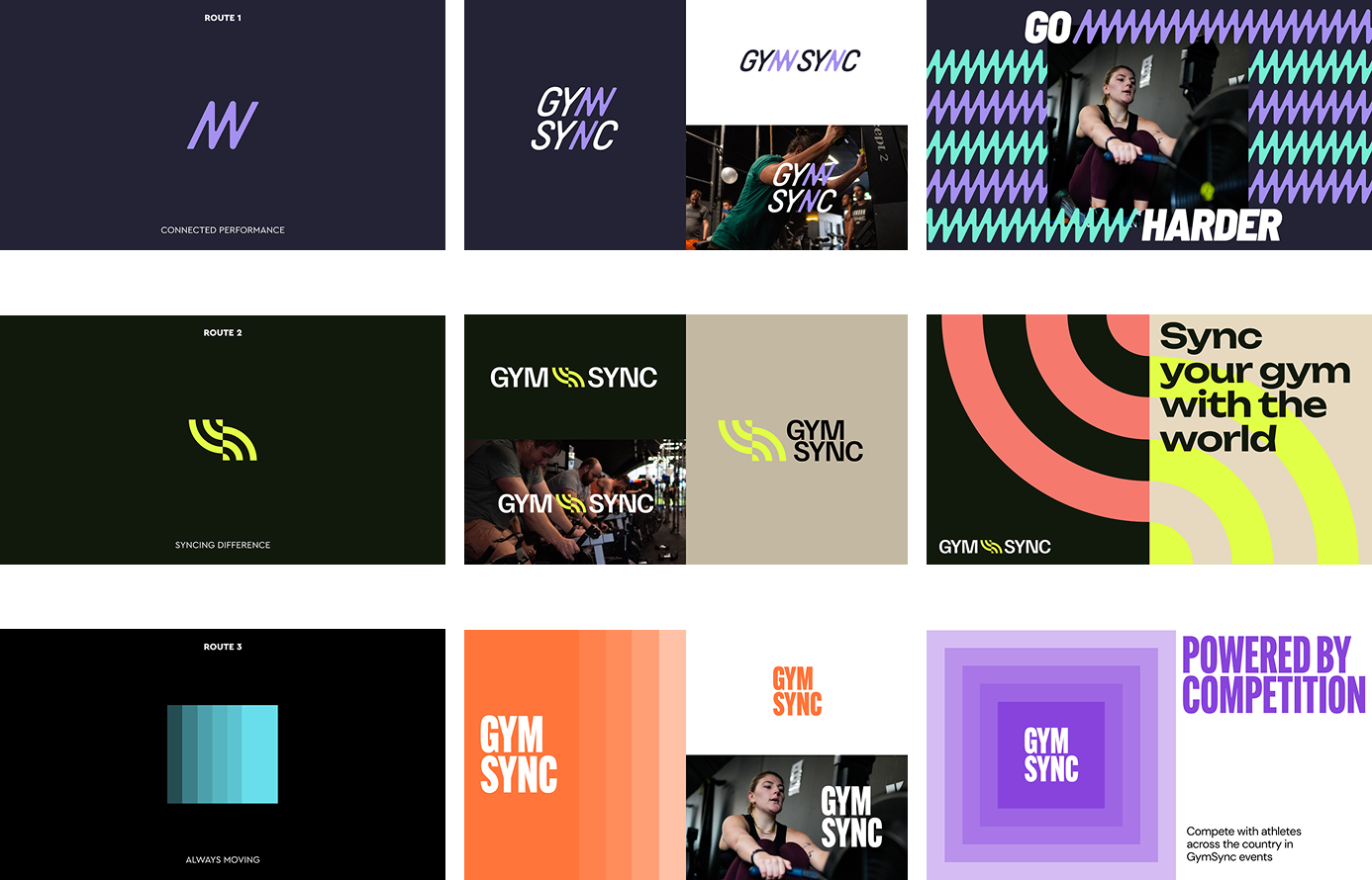
The project ran like a mini sprint, with 3 territories being developed quickly to establish the right space for GymSync. These were then refined into mini brand worlds with input from a range of stakeholders. The selected route was then refined further and built out into the new GymSync brand.

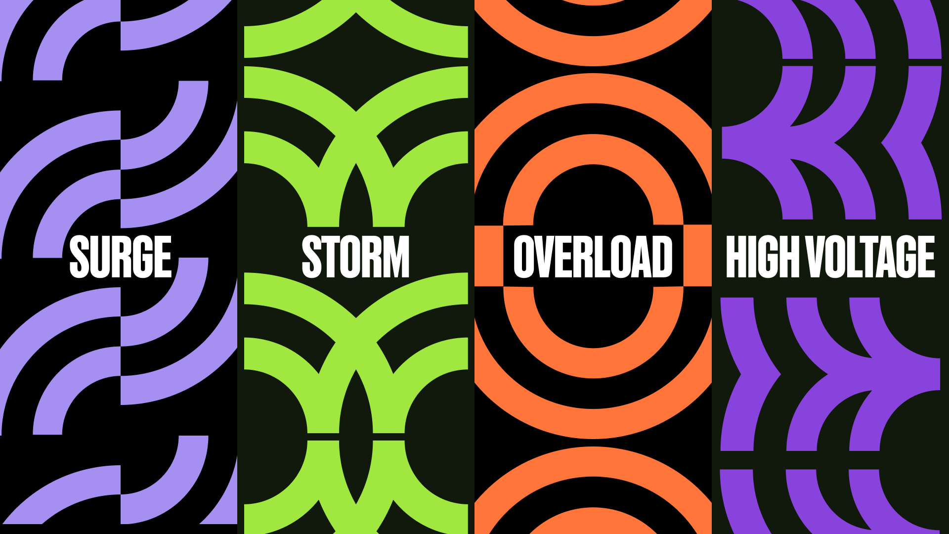
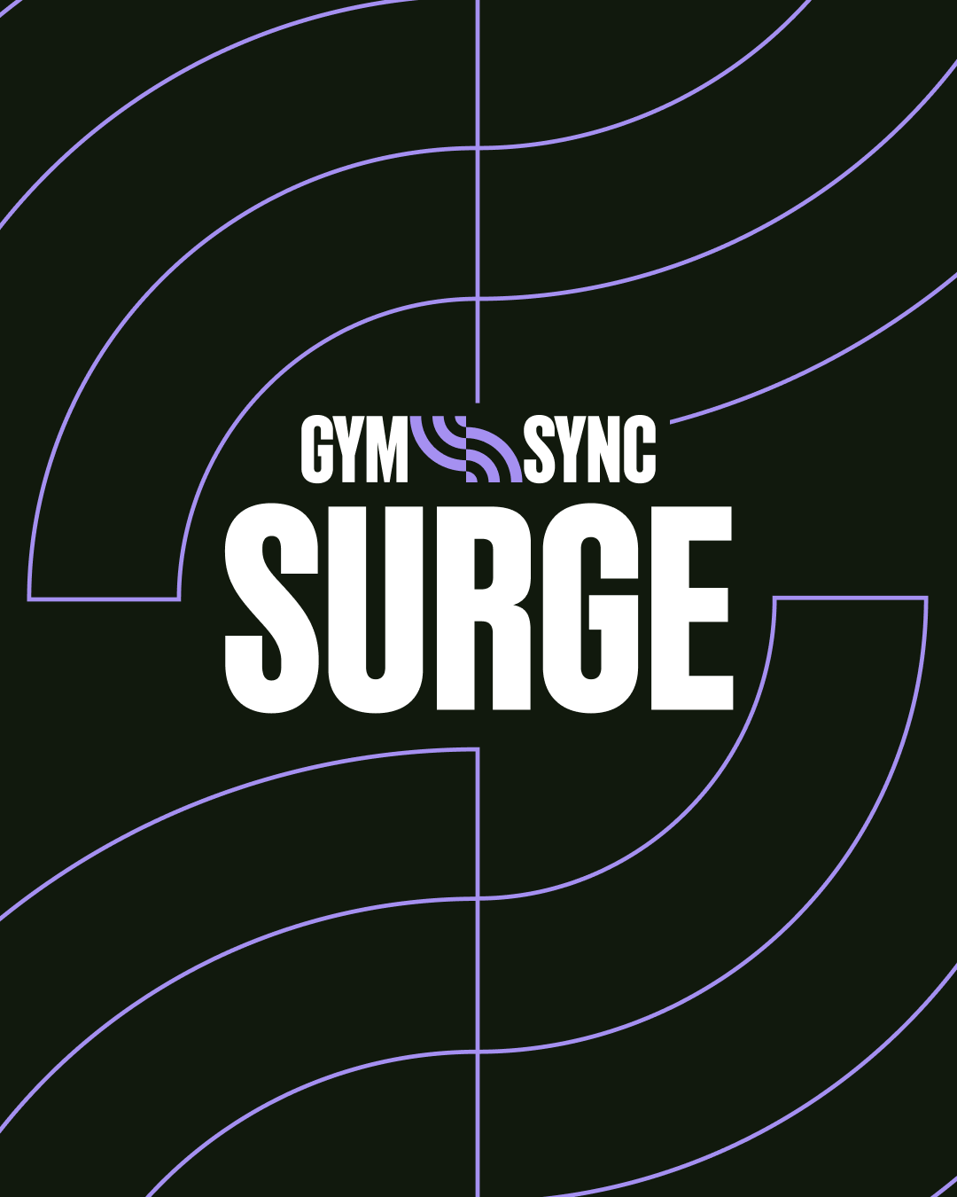
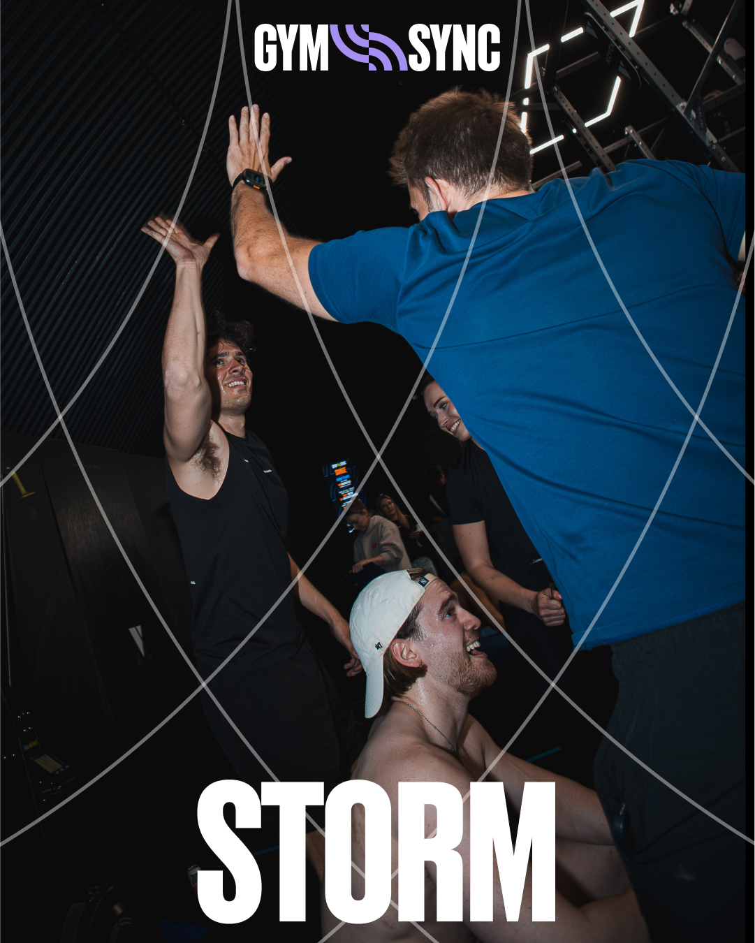
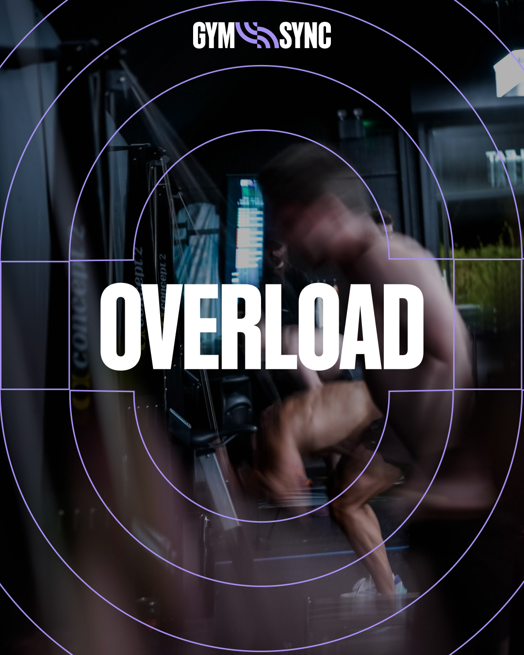
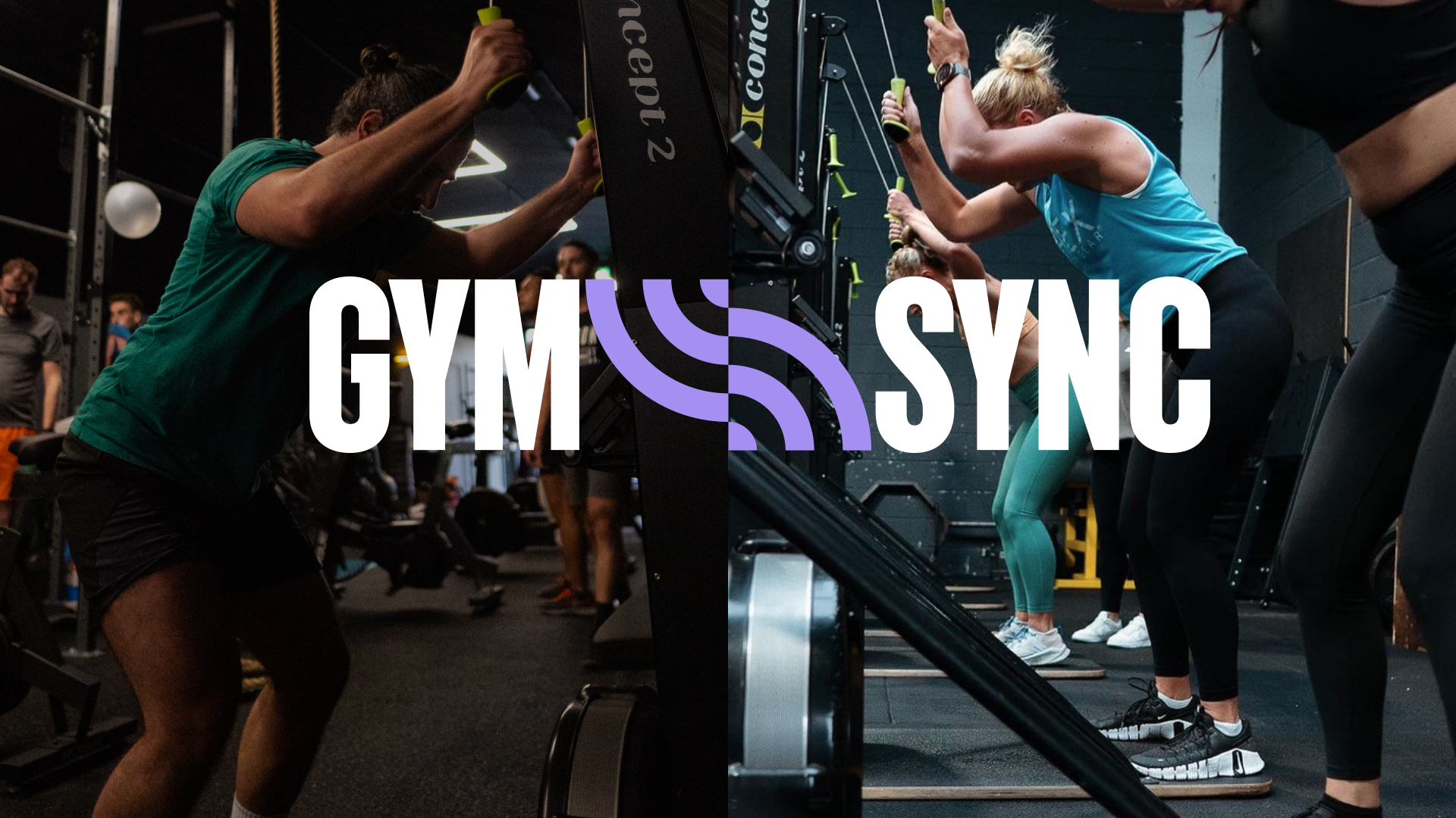
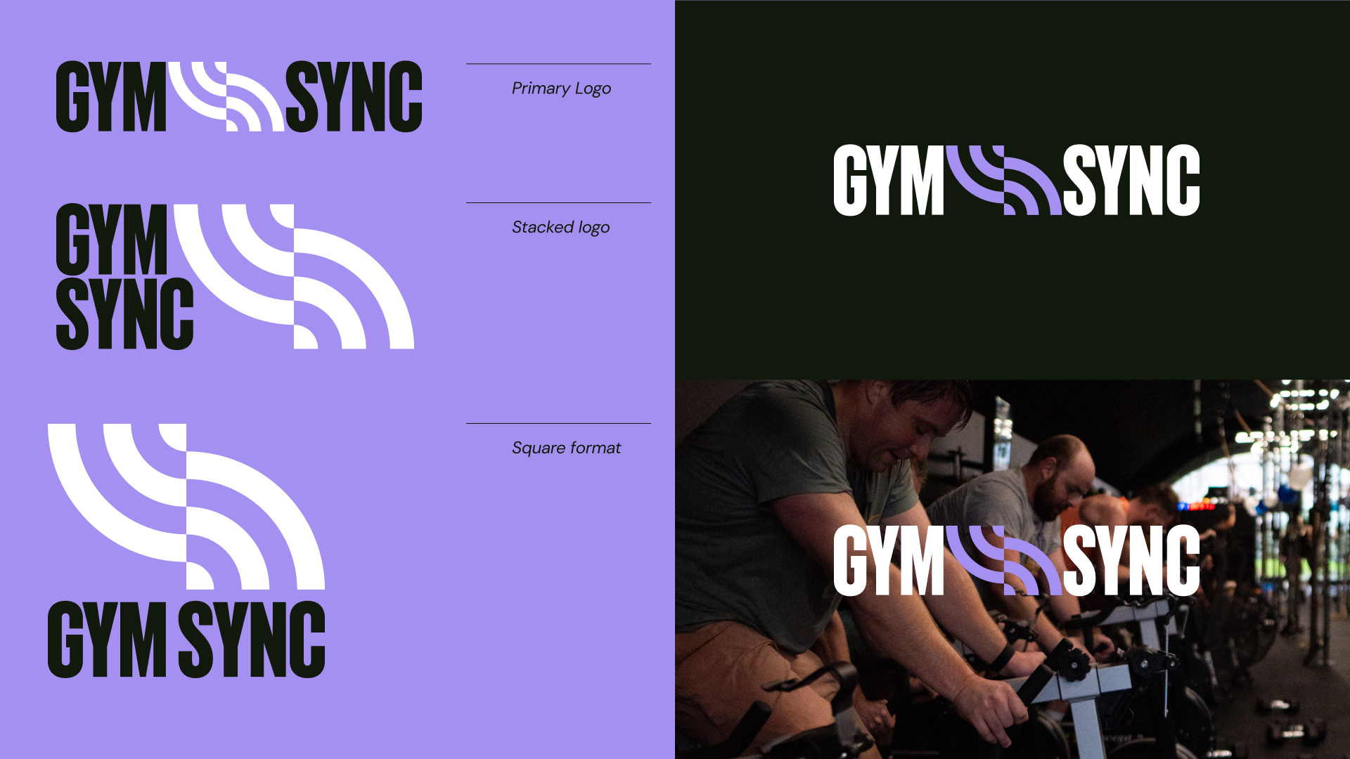
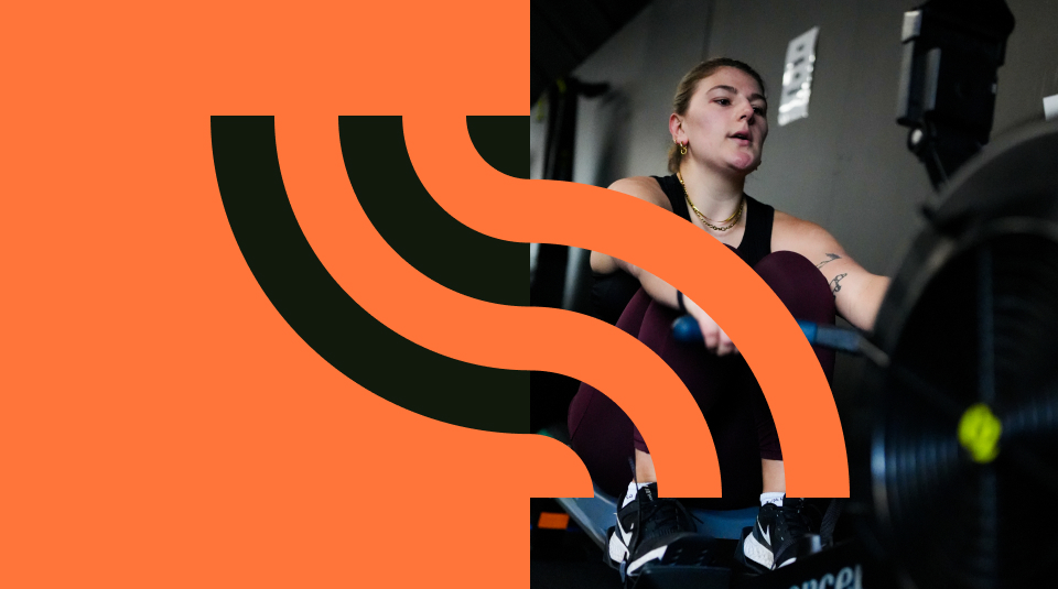
The final brand was based around the sync mark, a simple but expressive symbol inspired by human movement, with a clear visual link to the connectivity involved in GymSync competitions.
The mark is the basis for the logo, and serves as a flexible supergraphic for use connecting imagery and typography, interacting with layouts and when needed taking a more reserved presence for more considered brand expression.
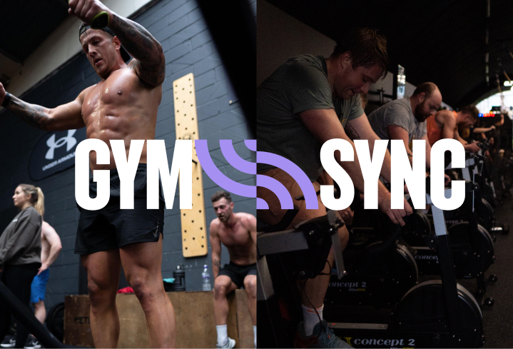
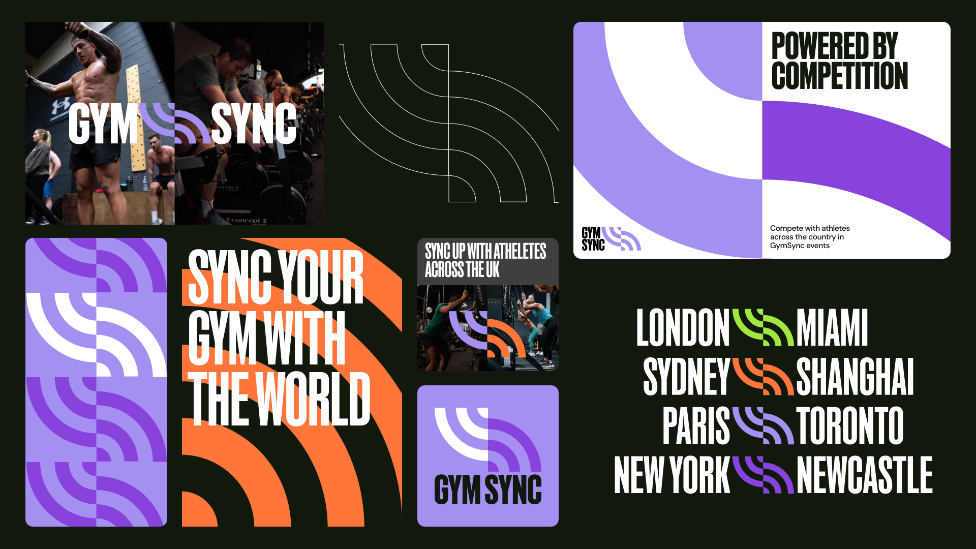
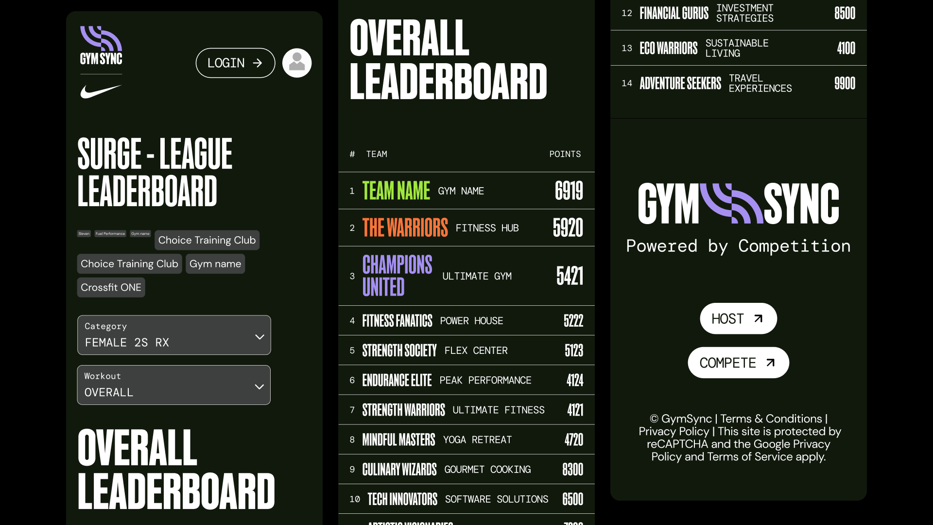
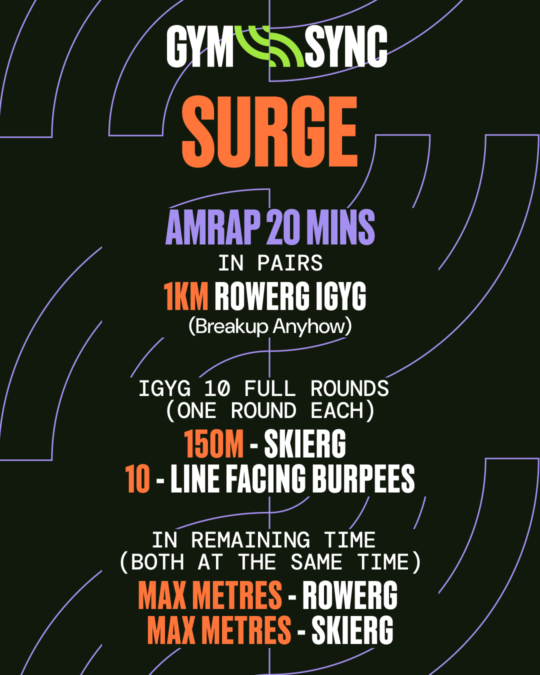
A fast paced & event focussed brand has to flex and adapt regularly, with a vast quantity of content produced, especially for social channels. This has regularly tested the GymSync brand; can it work with 10 partnership logos, can it work with another gym’s brand leading, does it still look good when crammed into a small corner of an instagram post.

As GymSync has grown, the brand has shifted and pivoted. More event focussed sub-brands using the same geometric shapes complement and expand the visual language while maintaining a strong brand connection.