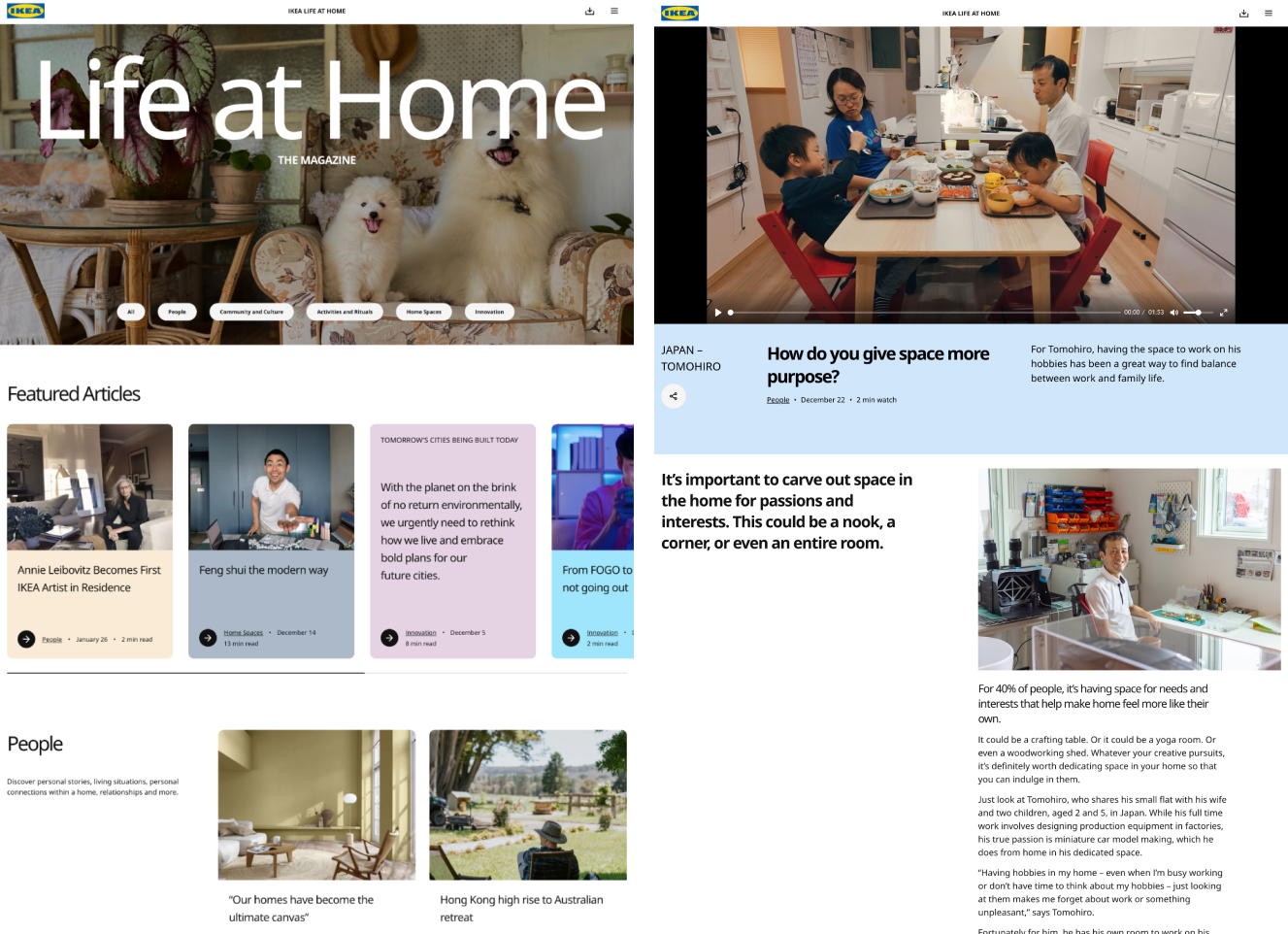
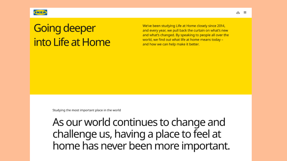
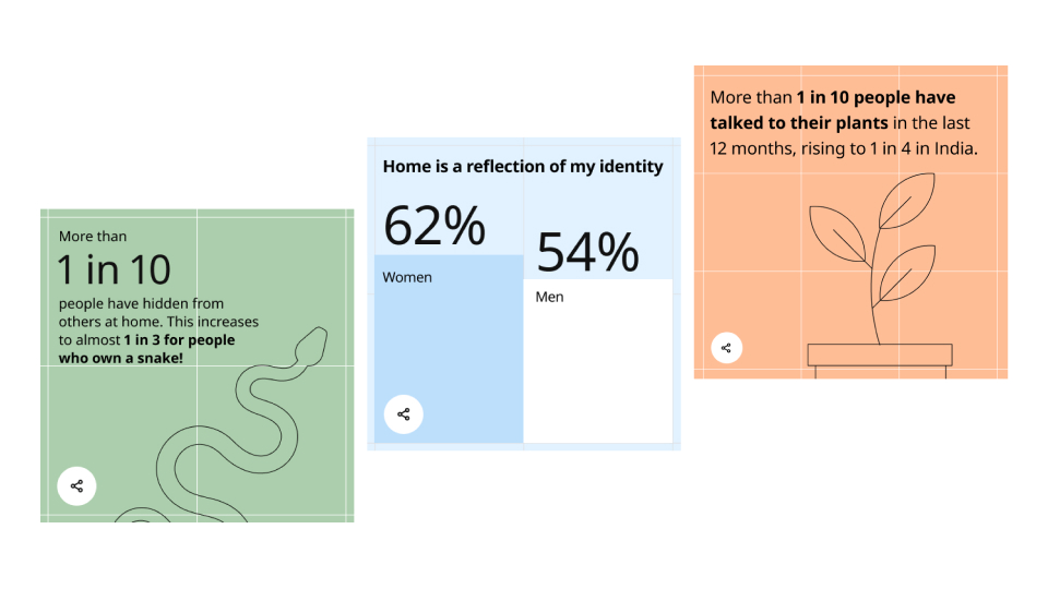
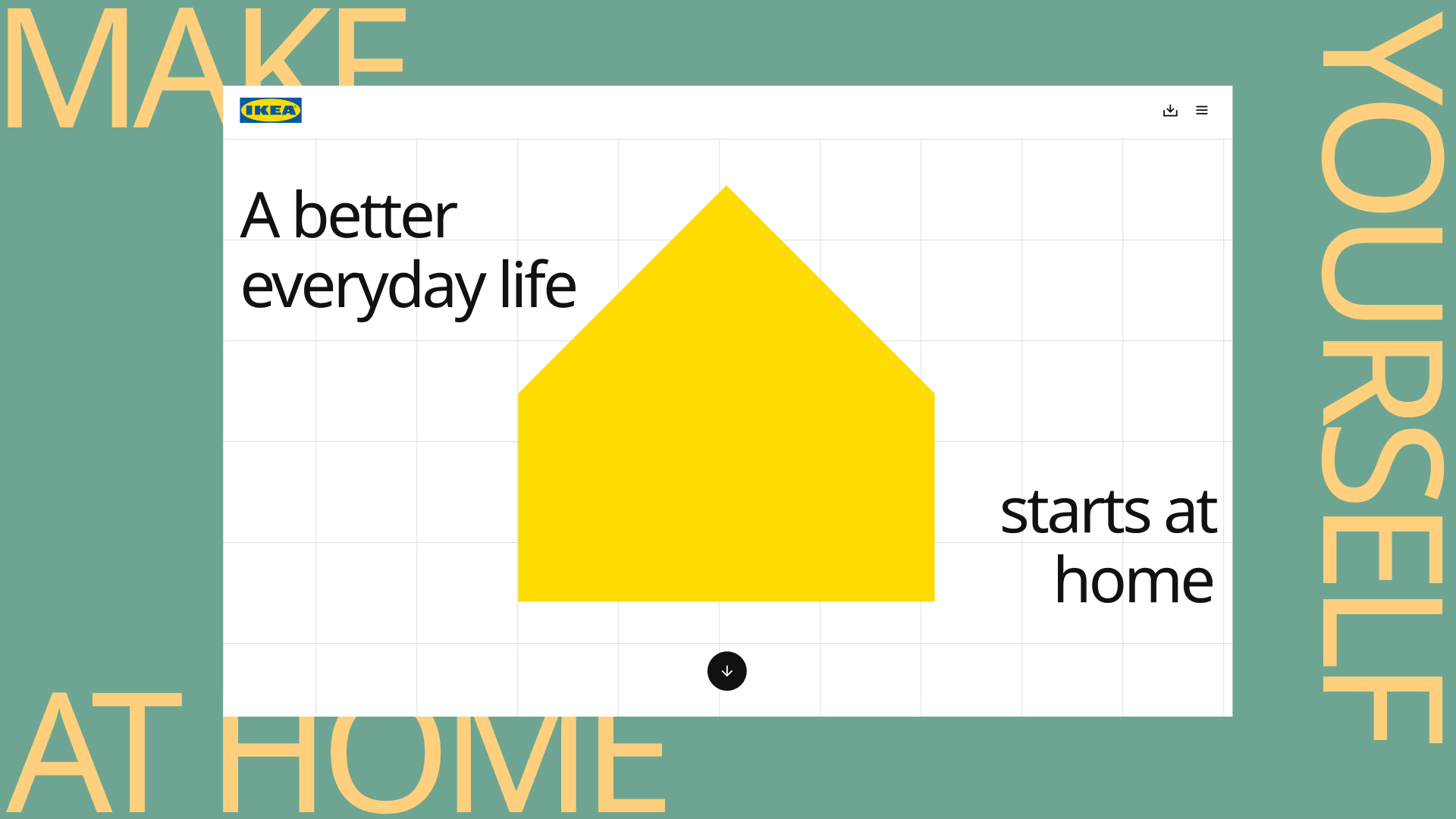
A new site for the IKEA Life at Home report. Each year the report focuses on a different topic around the theme of home, so the design needed to be able to be the long term home for the yearly report findings – as well as the digital home for a growing range of content around the wider Life at Home movement.
The site needed to nod to IKEA’s Skapa design system to match up in some ways with their overall digital presence; with license to utilise new functionality to help present the report insights in an engaging and compelling way.
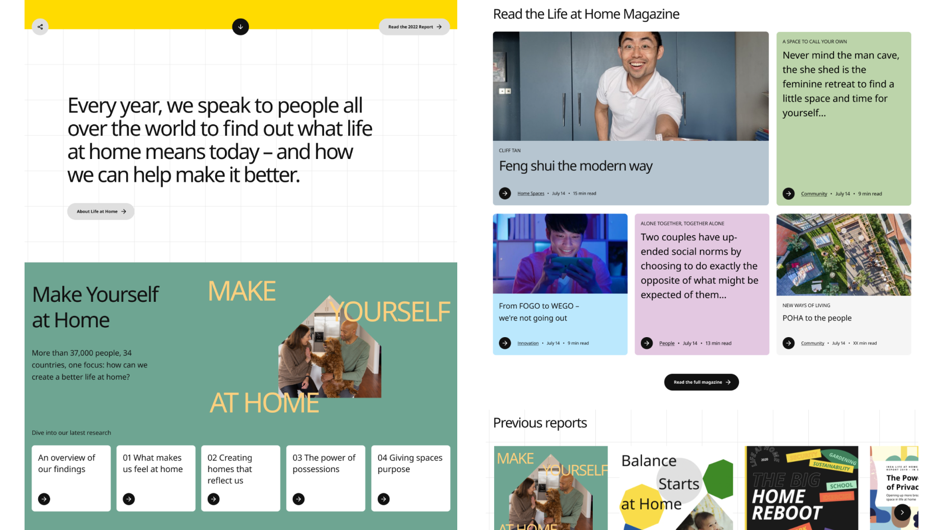
Designed to summarise the key findings of the full report, the focus was on on presenting digestible actionable insights to users for use in their own work or for sharing to a wider audience.
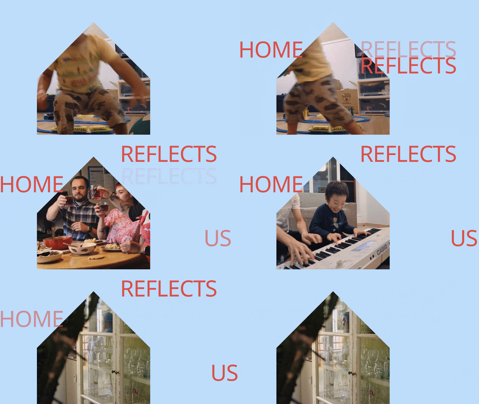
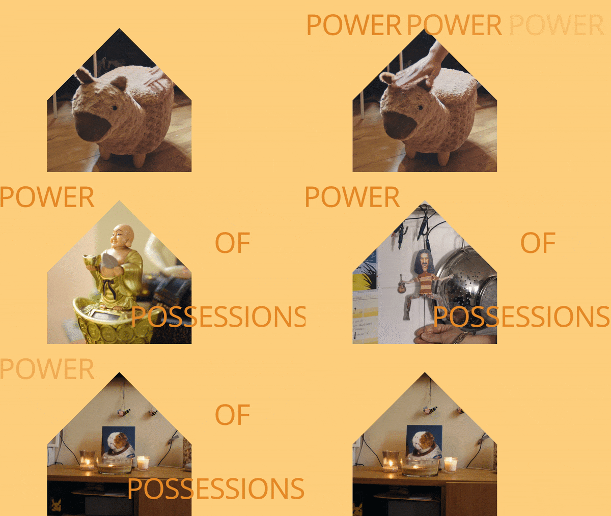
Expressive animated typography combined with photography from the report participants help express the unique relationships people have with their home.
As part of the site redesign, the blog was transformed into an online magazine to supplement the report and unpack more of the human stories behind how people make themselves at home. With longer form content the goal was to make the experience engaging and immersive, to make the reading experience intuitive and interesting.
