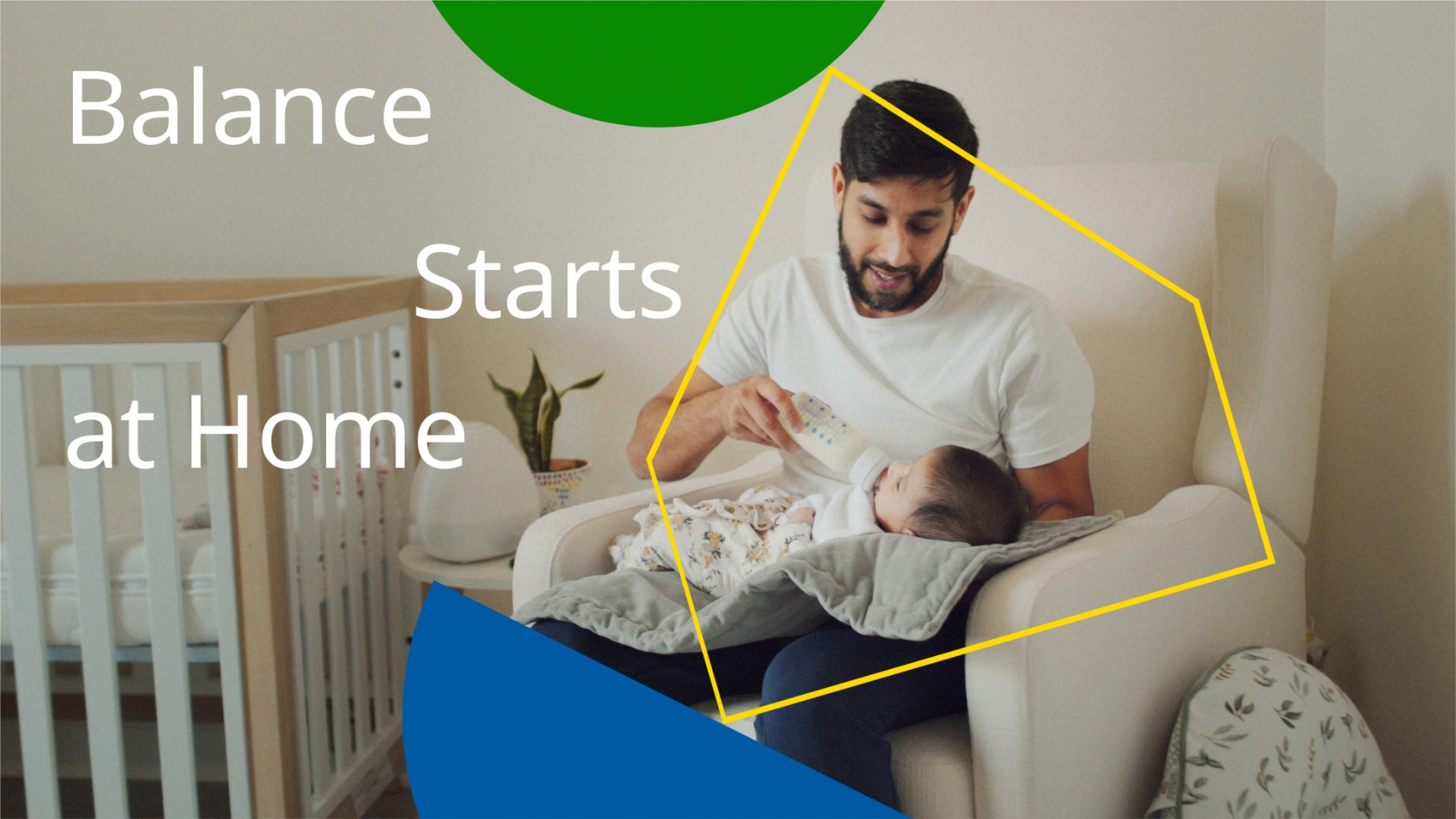
The 2021 edition of the IKEA Life at Home report focussed on the role of peoples homes in their mental wellbeing. Based around the idea of balance, the design led with a system of shapes that can interact and be used both abstractly and to convey meaning, to flexibly communicate around a complex and personal subject.

The entire report was hosted on a microsite to encourage users to engage with the findings in a more interactive way. Motion & interactions were used to bring the balance shapes to life, helping the report come to life.
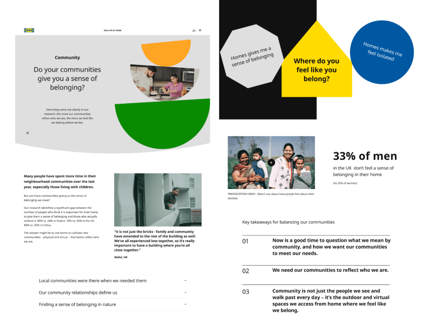
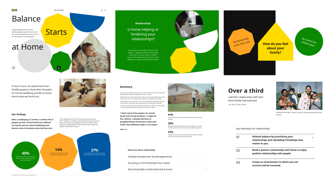
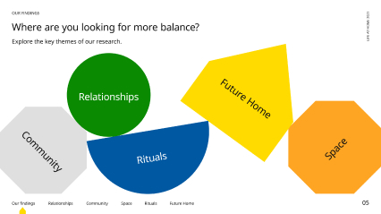
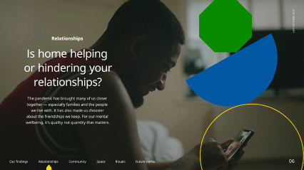
The digital report used provocations around the themes of the report to engage users and help the findings feel more relevant to them. Interactive elements help break up the more detailed insights.
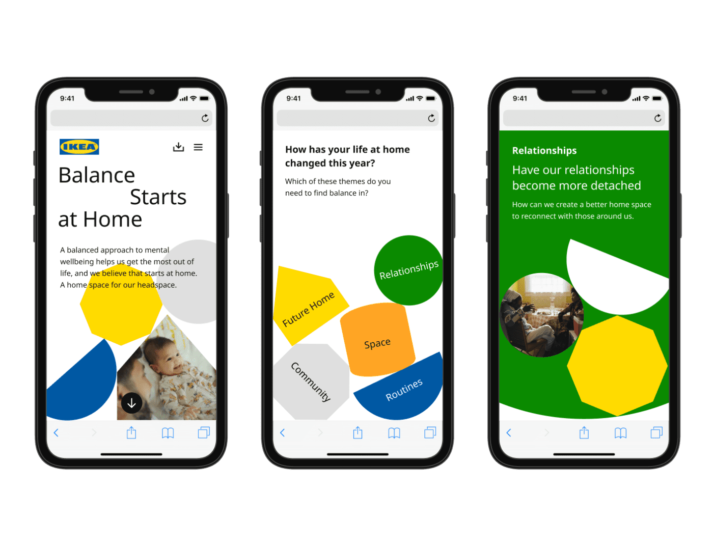
The entire site had to be built before the full report findings were fully realised, so the site had to be designed with a flexible and editable structure to ensure the insights would be readable and engaging for users. As the report was long (>5000 words) particular attention was paid to ensuring the mobile version of the site was usable and broken up into clearly organised sections.
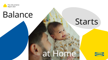
A pdf version of the report was also produced using the same graphic system, with the shapes balancing and interacting with participant photography to add tension and visual interest to the static format. Large format imagery and greater use of bold colour helped with the pace and flow of the document.
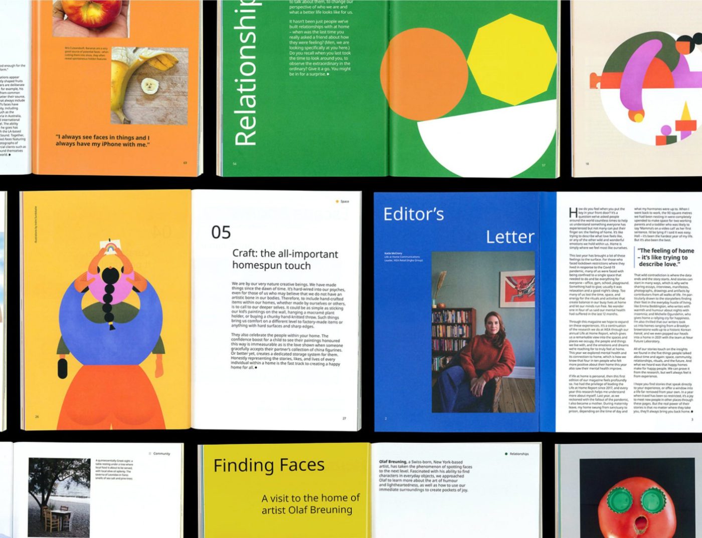
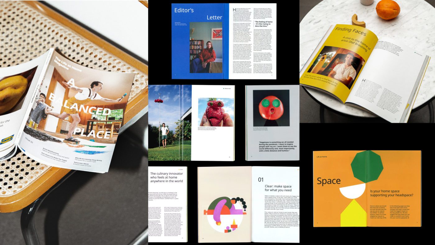
As part of the project we Art Directed and Designed the very first Life at Home magazine inspired by the report findings. A more editorial translation of the design system was developed, to help bring the report to life in this new format. We also commissioned 21 features, photography and illustrations from a range of contributors.