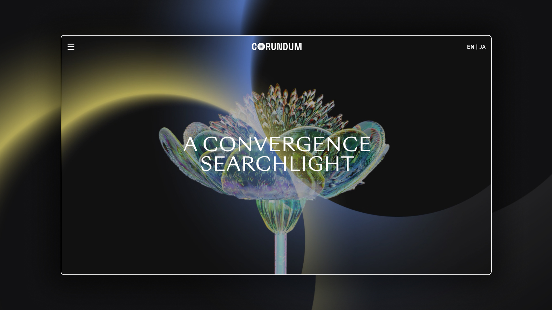
Working with the lovely team at Saboteur I designed 2 new sites for Corundum Corp and their innovation fund Corundum Convergence Institute.
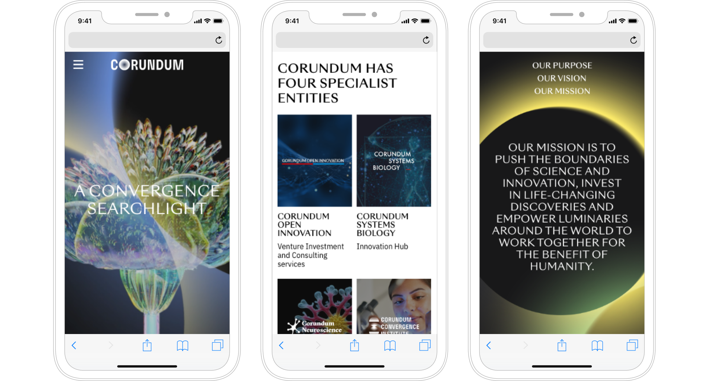
Both projects draw from the same brand world, but with contrasting expressions. The Masterbrand digital experience had to be experiential and tell an inspiring story about the company.
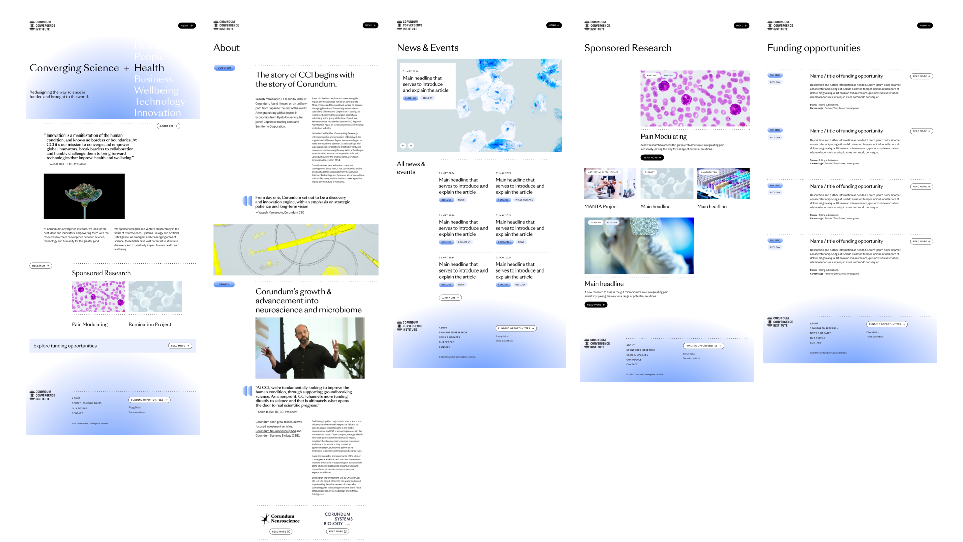
The innovation fund required a more research focussed & stripped back approach. To align more with the philanthropic nature of CCI. As an endorsed brand of Corundum it used a similar palette of colours, typography & imagery but expressed in a more clinical and informative way.
Corundum Corp site
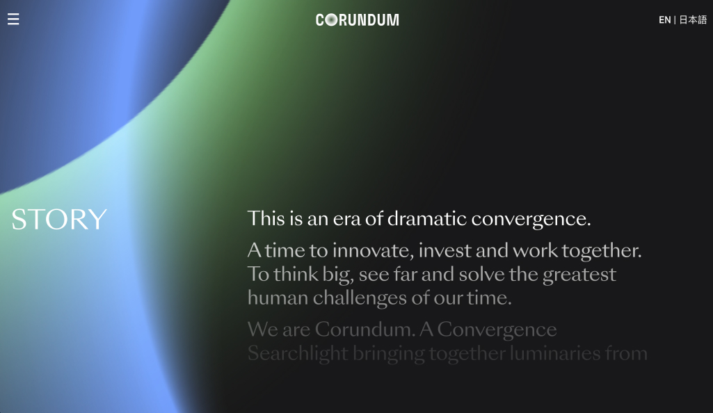
The new Corundum brand embodies the convergence of science, technology, business and beyond with searchlights that scan and sweep across the website as the user navigates around.
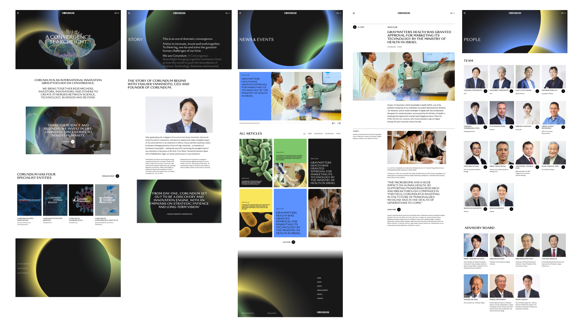
I worked on bringing the brand to live in the digital space, with animations of the converging searchlights, special rollover effects and a custom cursor. All this helped build a dramatic and inspiring user experience that resonated with the Corundum brand.
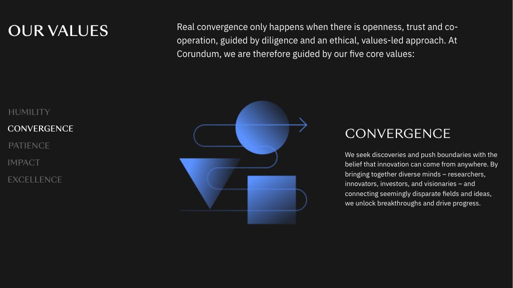


Corundum Convergence Institute
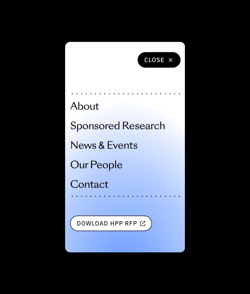
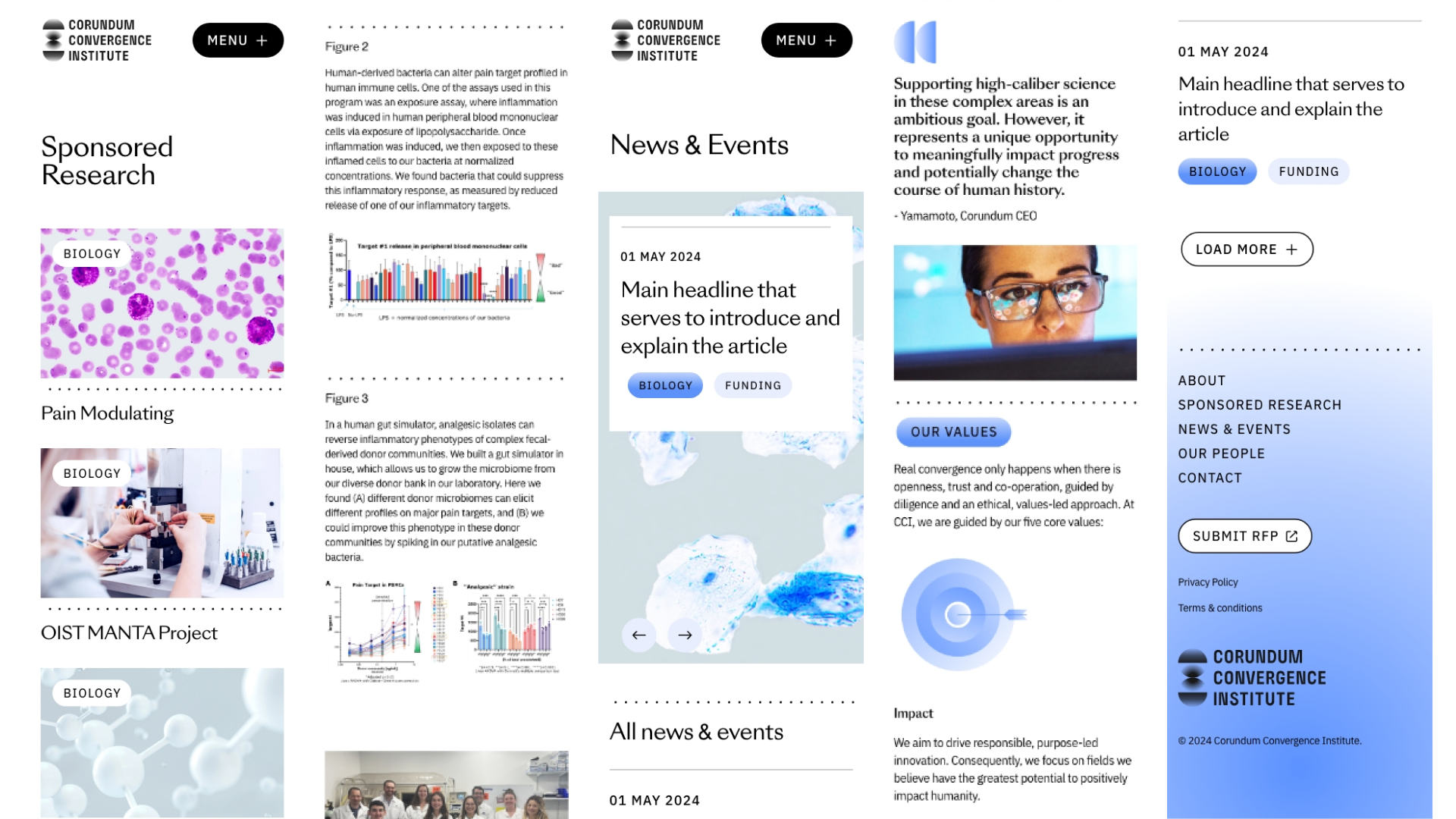
Corundum Convergence Institute needed a very different approach, with a much more clinical and pared back visual identity. I designed a simple and clean site that lets everything breathe and better represents the organisations personality.

Agency: Saboteur
Role: Lead Digital Designer
Both sites built by designersfriend.uk/
