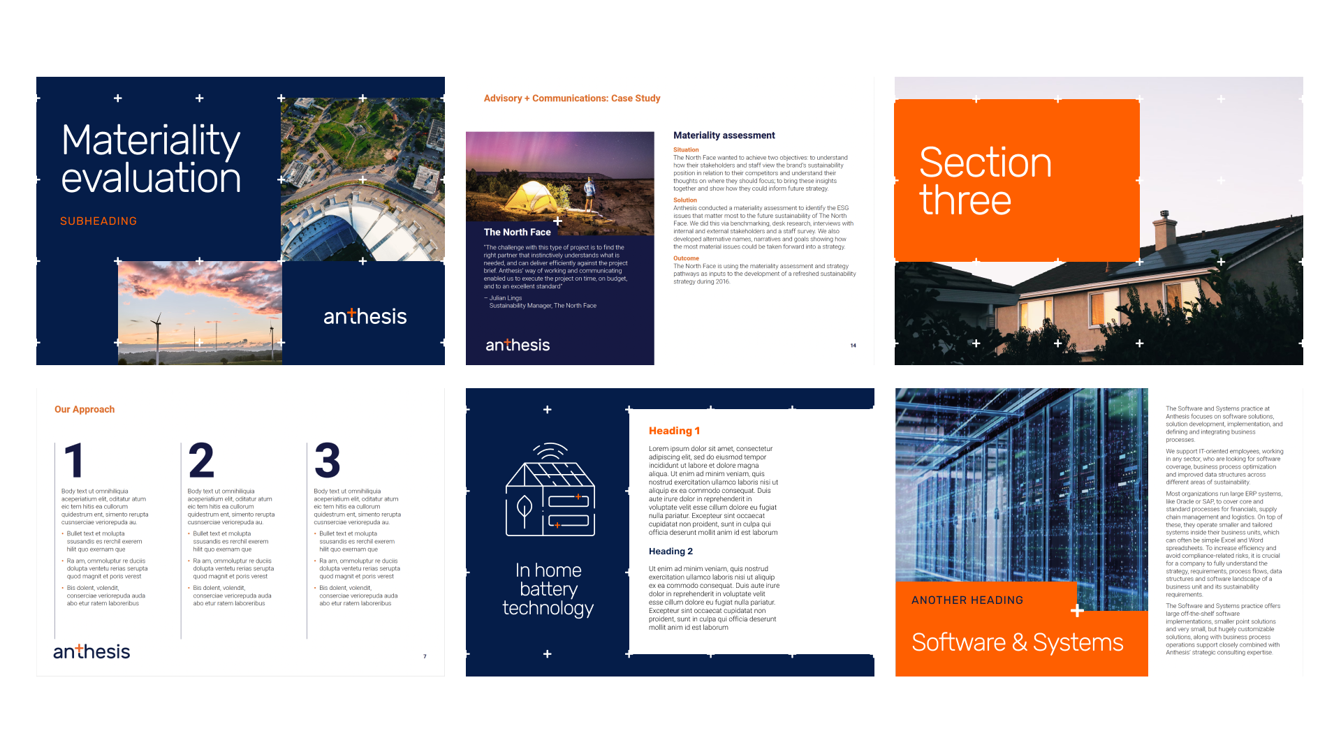
Shaking the visual cliches of the sustainability world I designed a new brand for Anthesis that better represents the value they add to businesses.
Based on a new positioning as ‘sustainability activators’ – driving performance through sustainability, the new brand avoids the commonly used visual language of the sustainability industry.
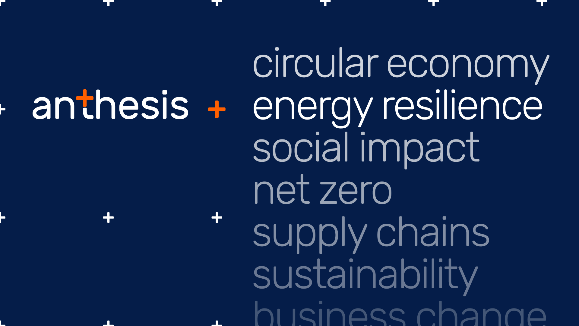
A simple new logo that is the centre of a developed graphic system, combined with a clean & contemporary colour palette gives Anthesis a sophisticated & professional brand that elevates the important work they do.

The plus sign in the logo represents the real business value Anthesis add through sustainability. It becomes the foundation of the design language – forming a grid to hold imagery and content, integrating into illustrations & is used as a connector to link business & sustainability themed imagery.