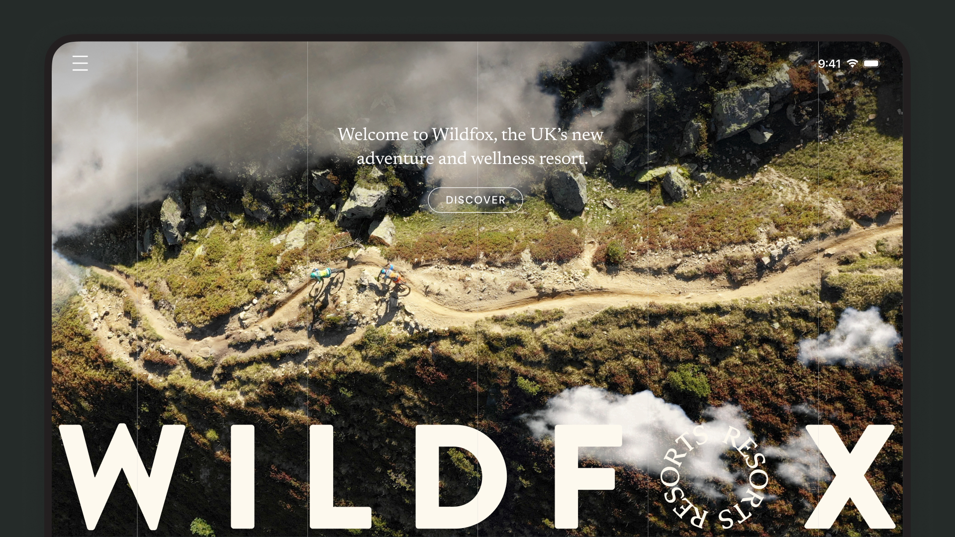
Working with a brand new luxury adventure & wellness resort in the Afan Valley in South Wales to help them develop refine their brand and launch a brand new website.
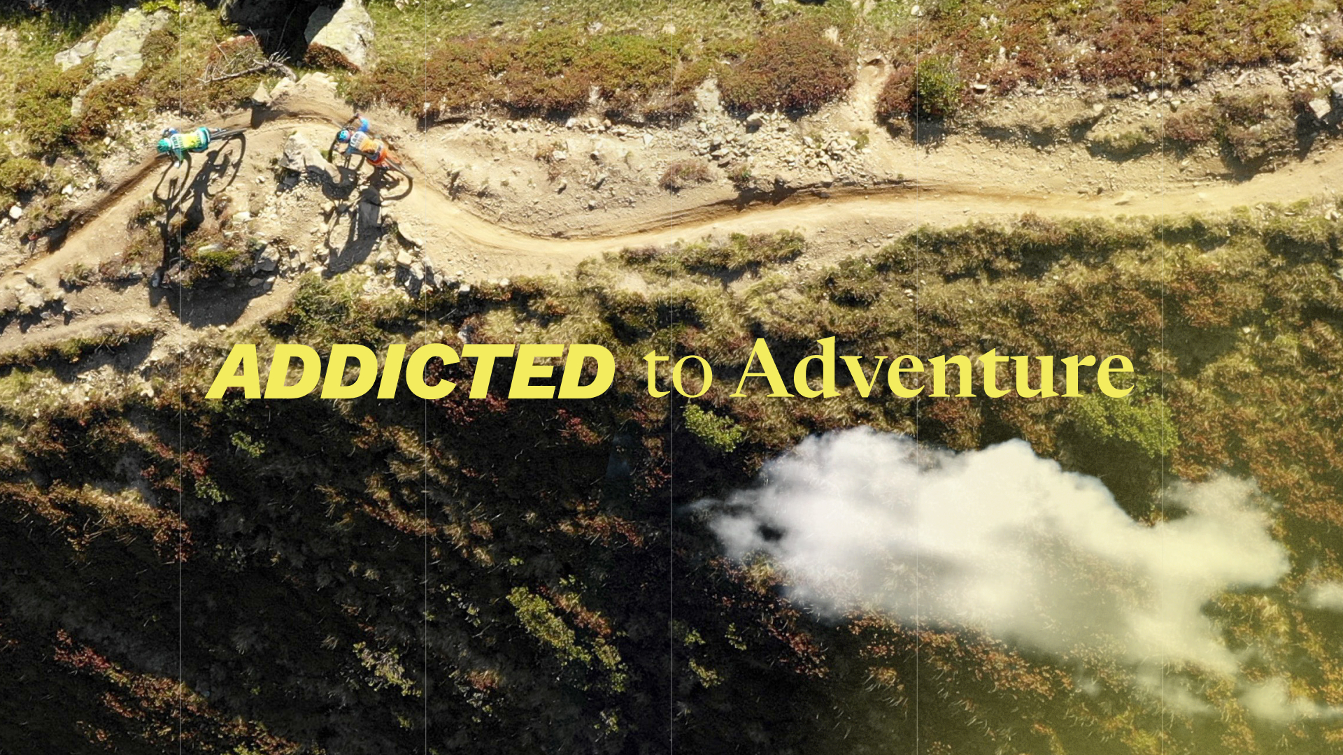
A next-generation resort where adventure, nature and wellness collide, Wildfox is a new destination with 132 hectares of mountain biking, outdoor adventure, wild swimming, wellness as well as a ranging array of entertainment, dining and accommodation options. They had worked with an agency to arrive at their brand strategy; Addicted to adventure, and needed some help with developing the visual side of the brand, to make it more practical and bring it to life.
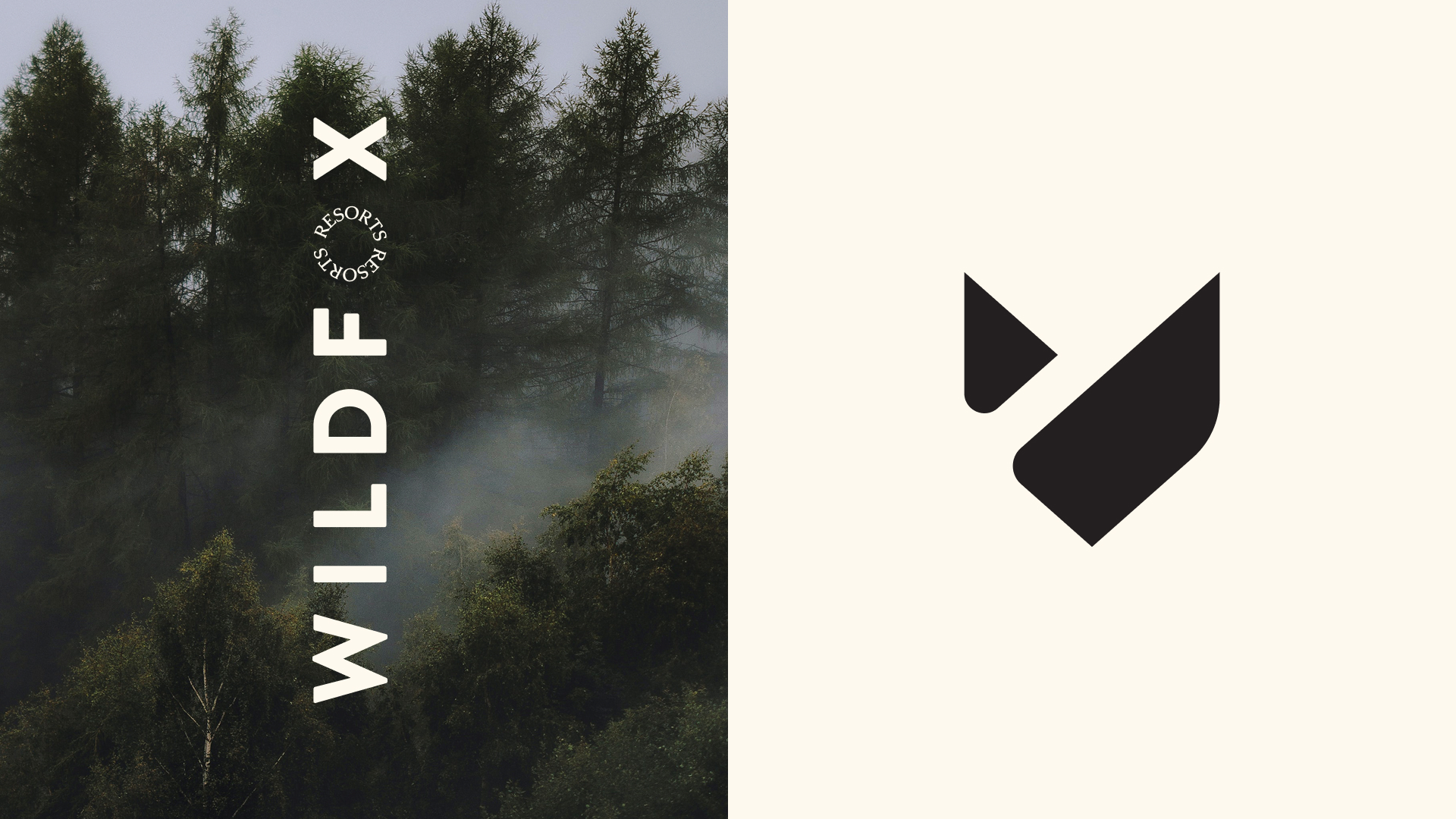
With the brand strategy and logotype/marque already established we had strong foundations to take forwards. I worked closely with Tom the CEO to develop the colour palette, typography and to begin to articulate the more nuanced bits of the brand.
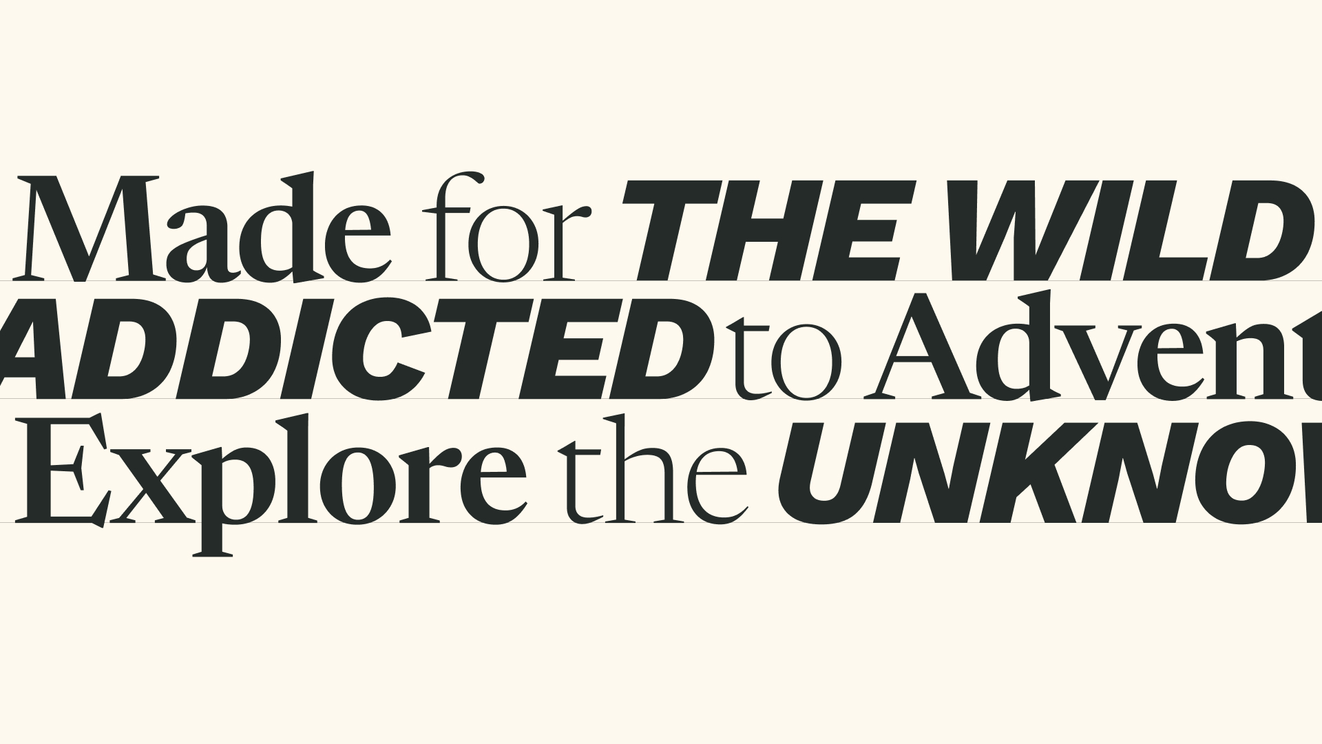
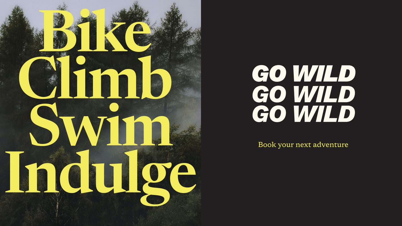
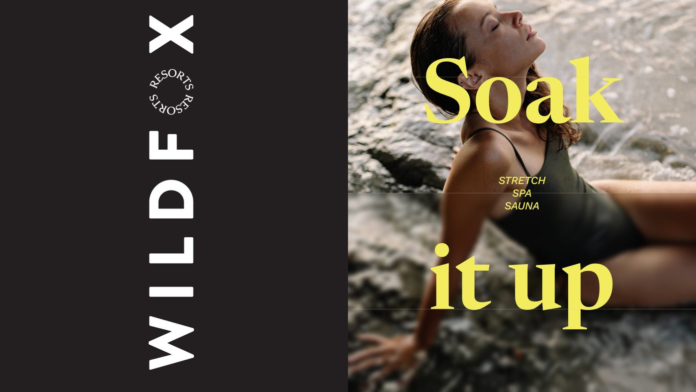
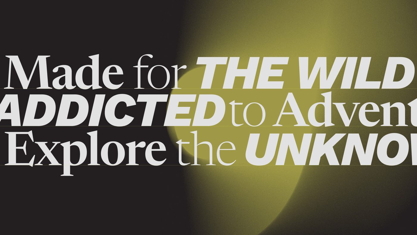
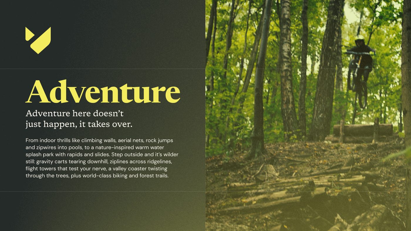
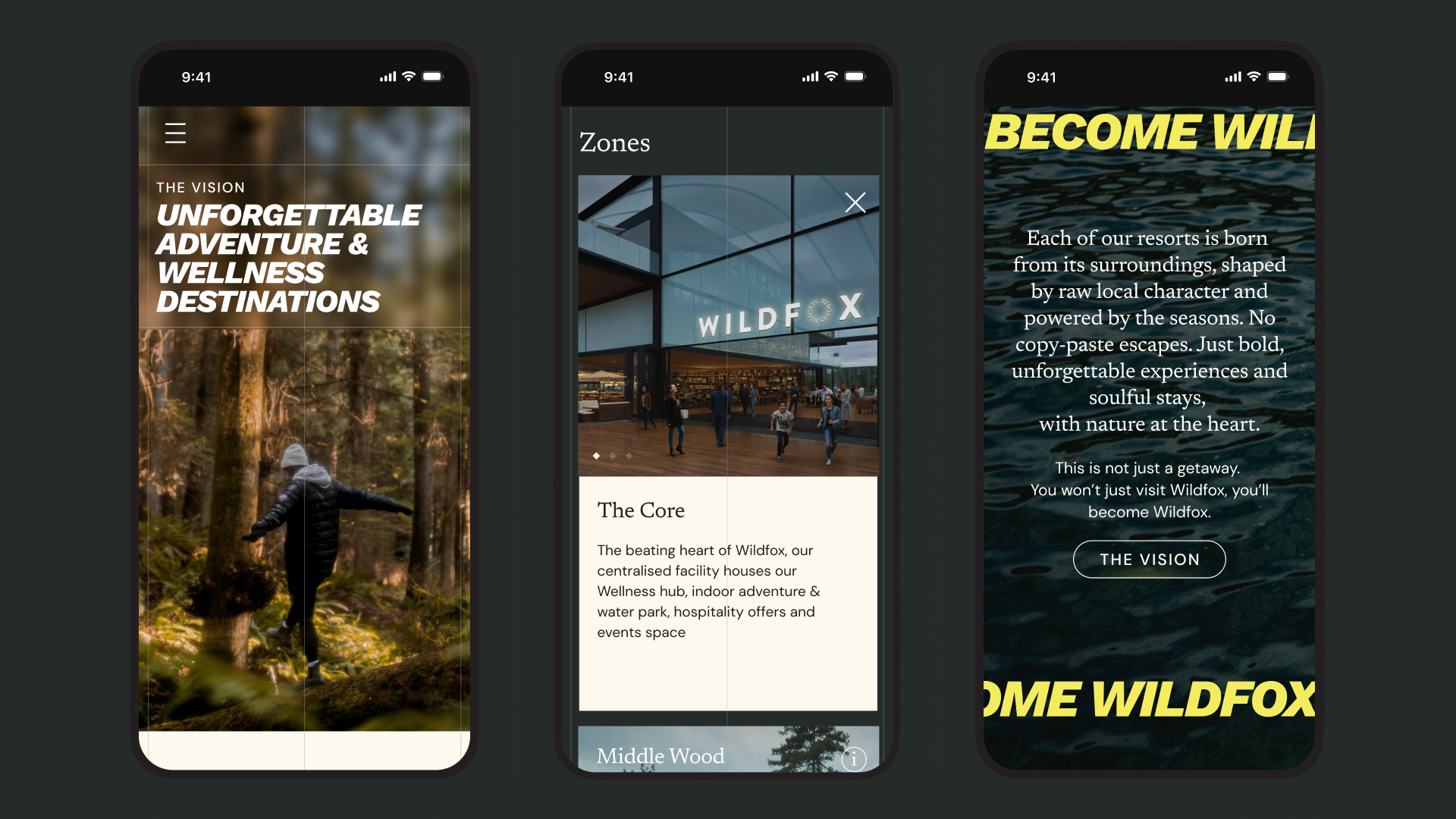
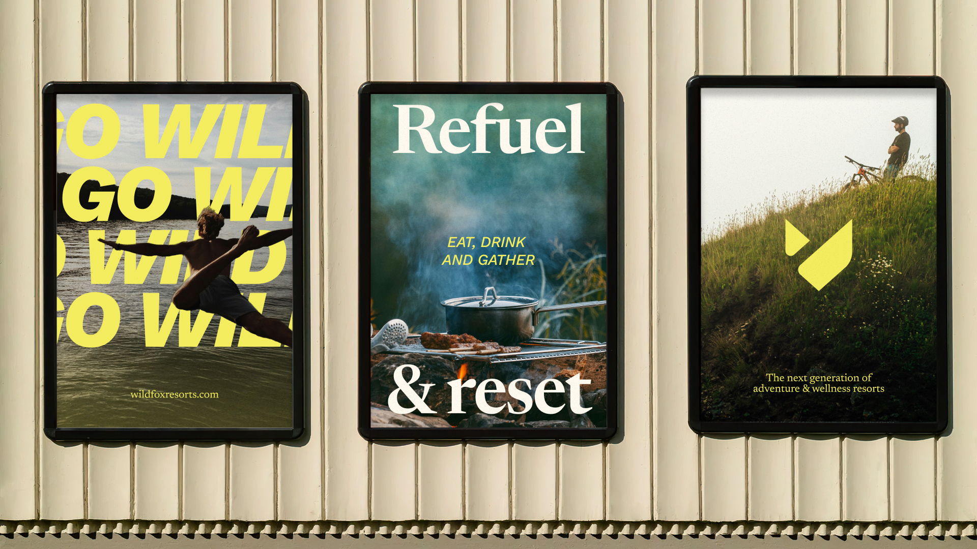
Typography became an important part of the visual language, with a combination of an elegant and calming serif in Newsreader working with a bold & impactful sans-serif in Work Sans helping create tension, variety and give plenty of character to the brand. Layouts use type to show dynamism, calmness, confident & warmth – with the ability to flex and reflect the differing communications that make up Wildfox.
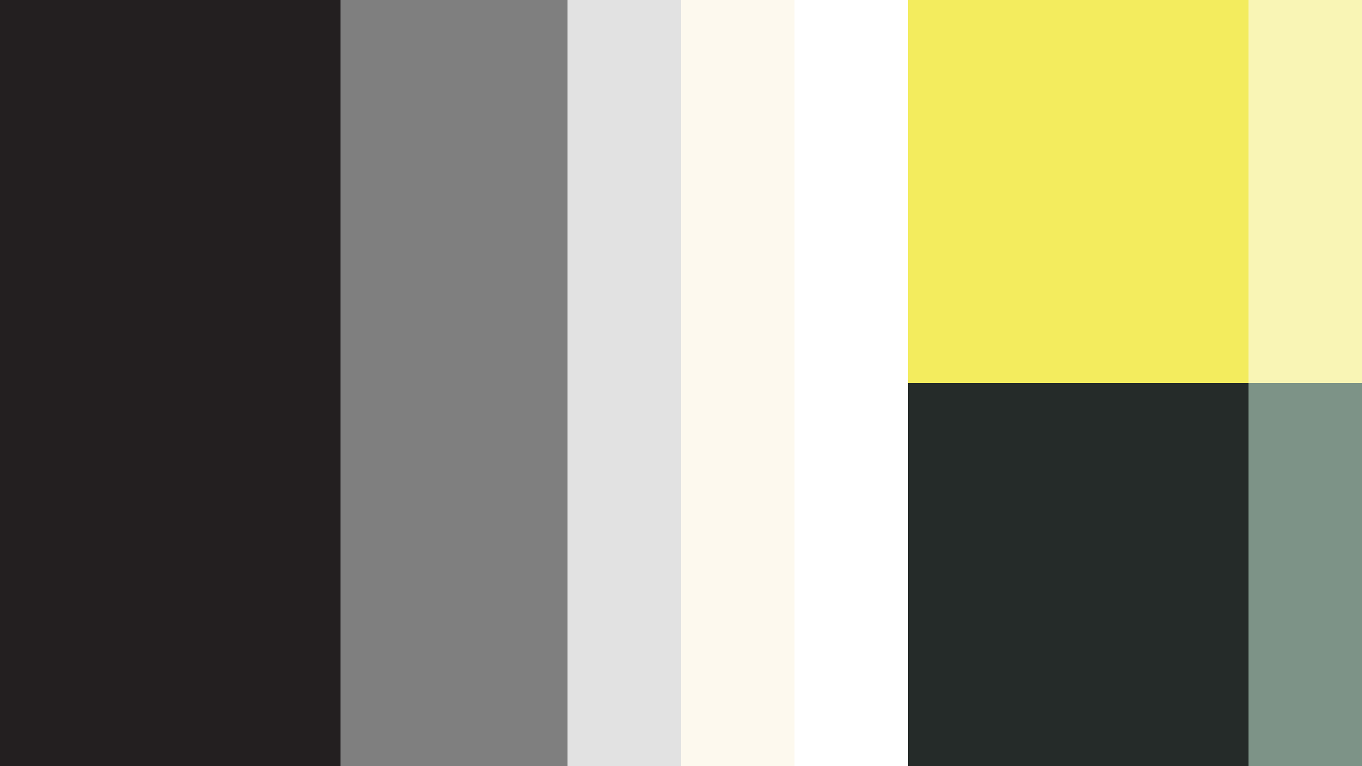
The colour palette also needed developing, with the need to reflect both the calming earthy feeling of being surrounded by dense trees, by a lake in the mountains, with the electric & vibrant adventure sports available. We utilised an acid yellow colour to cut through and be the north star for the brand, with good own-ability, combined with warmer and calmer tones to balance and contrast.
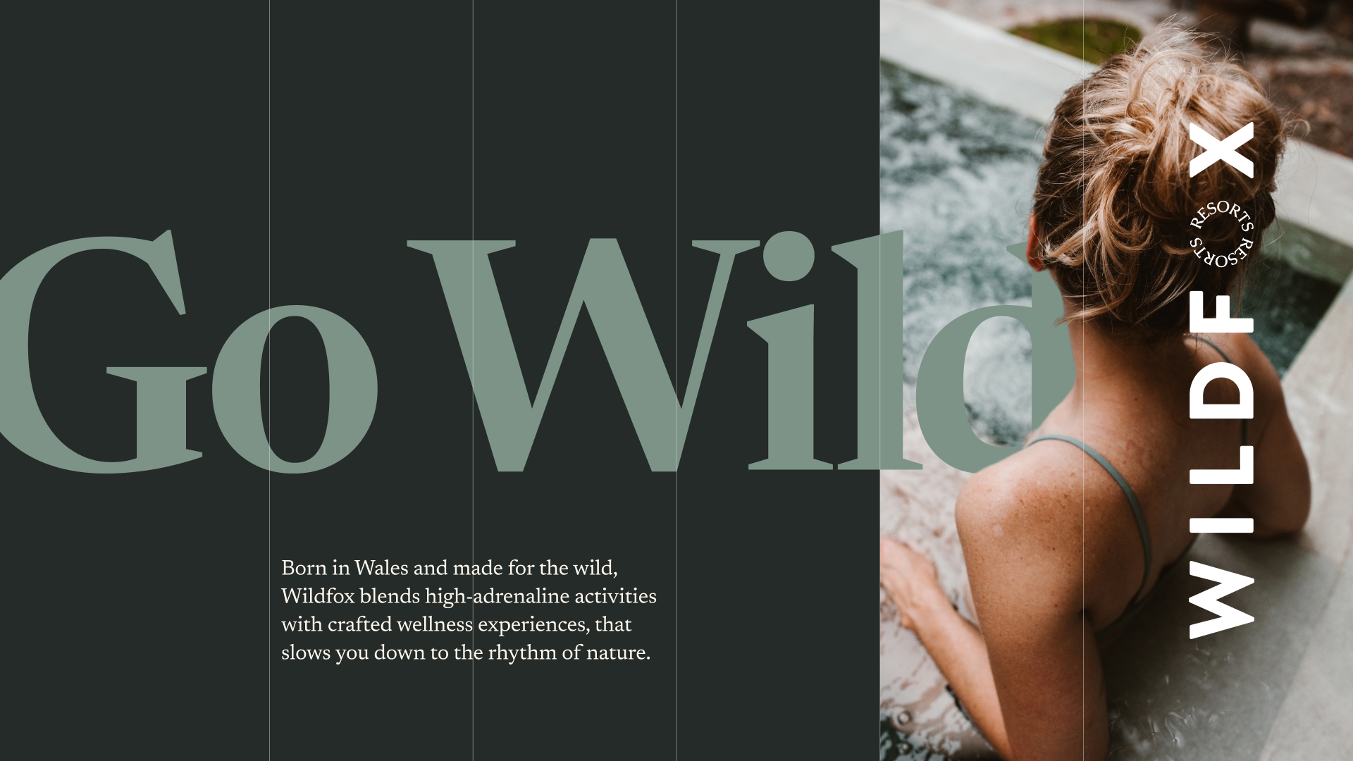
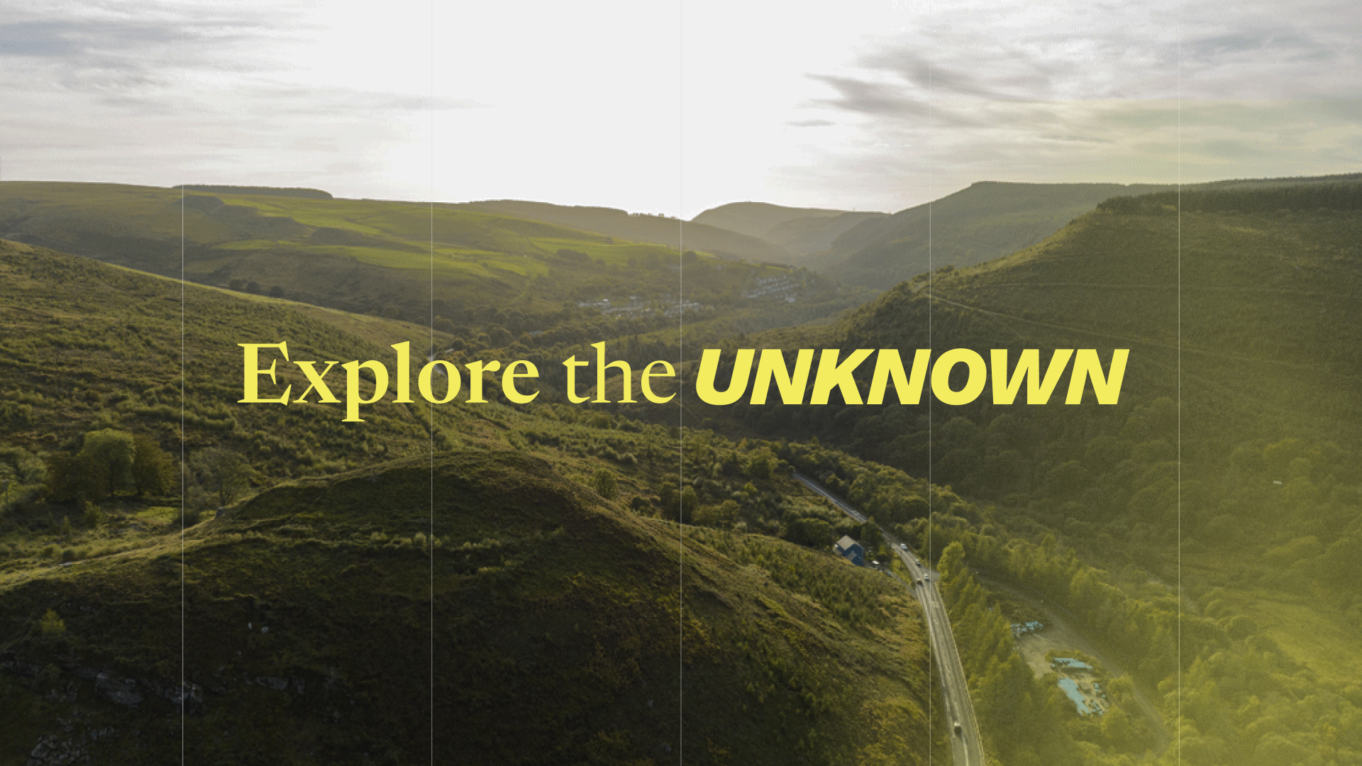
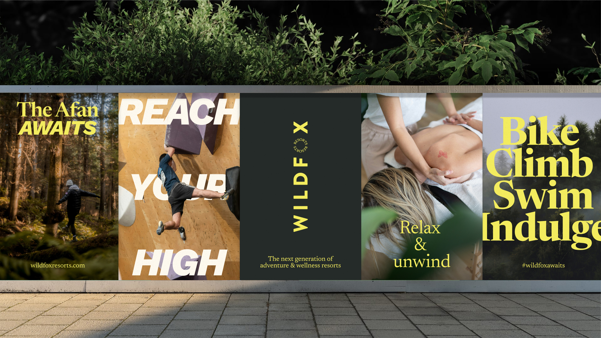
The brand comes together in the below examples, with dynamic and energetic typography working hard to create energising OOH that focus on experiences, wildness and relaxation. Flexing between high octane and soothing indulgence photography is bold and direct, with more textural imagery helping balance out more dynamic and assertive shots.

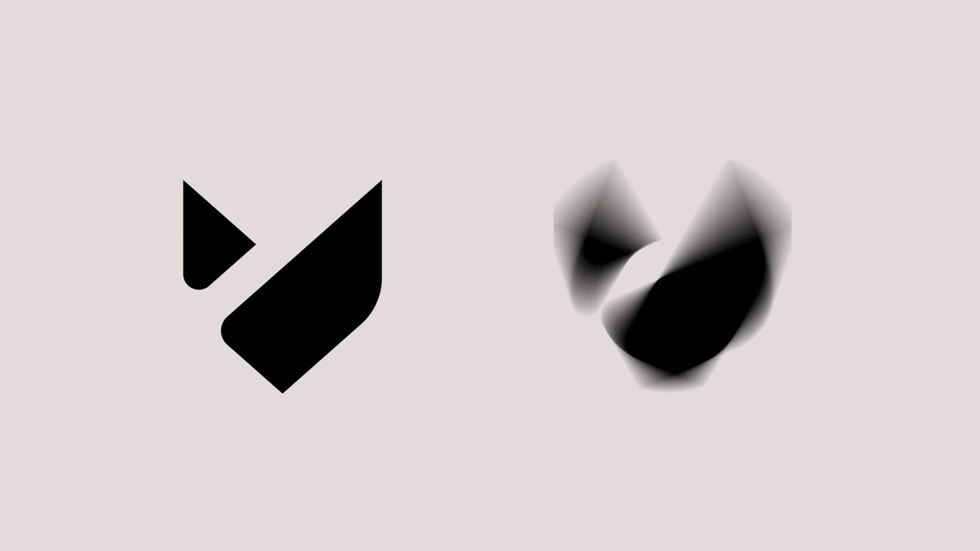
Extending out the graphic language, the logo marque pulsates and fizzes, like a butterfly’s wings to create more texture and depth – these can be used atop of imagery to add colour and vibrancy, or as backgrounds with elements on top where imagery is less useful. This system really comes to life in motion, where it can electrify and join together different parts of the brand.