A rebrand for We Are Group, a digital training and education organisation who empower people with digital skills & knowledge to help them succeed.
The goal of this work was to evolve We Are Group’s brand identity to elevate and amplify their unique position as a driver of digital inclusion.
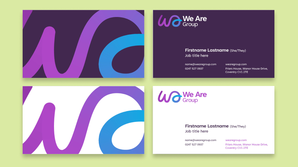
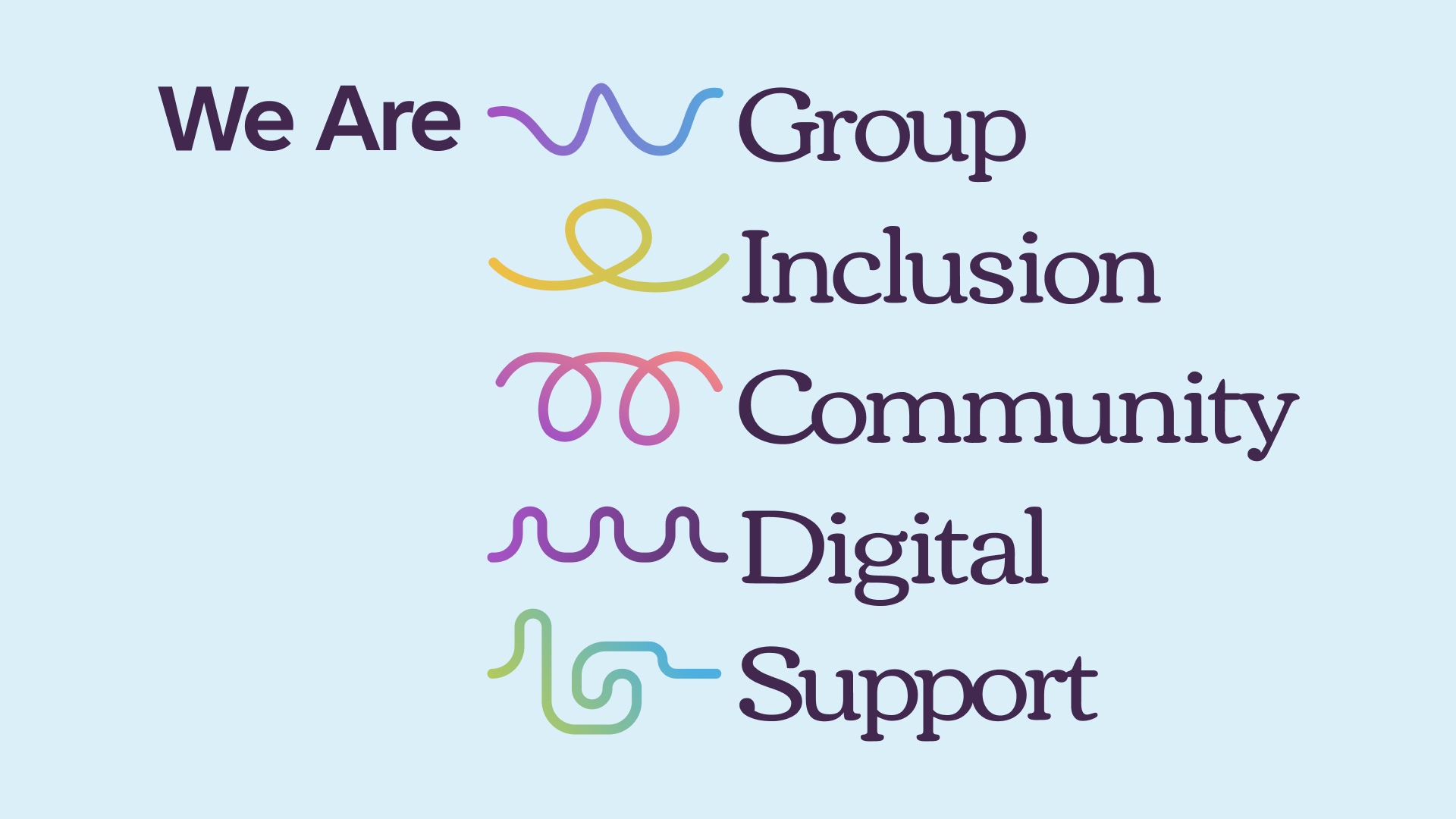
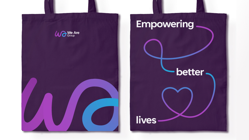
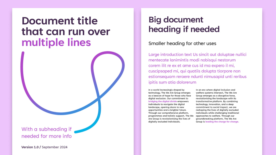
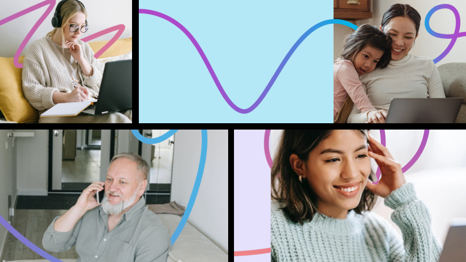
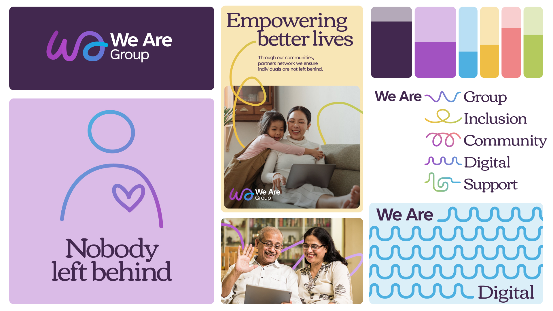
Inspired by their Purpose; to “empower people in need to live a better life” the new brand is anchored by a connecting line that represents the connection, impact and change that the organisation has. The line can wrap around people in photography, connect typography and is the foundation of all visual elements.
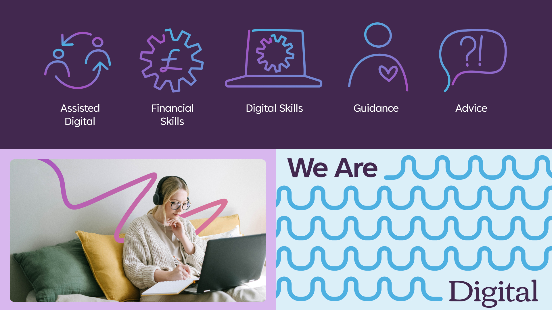
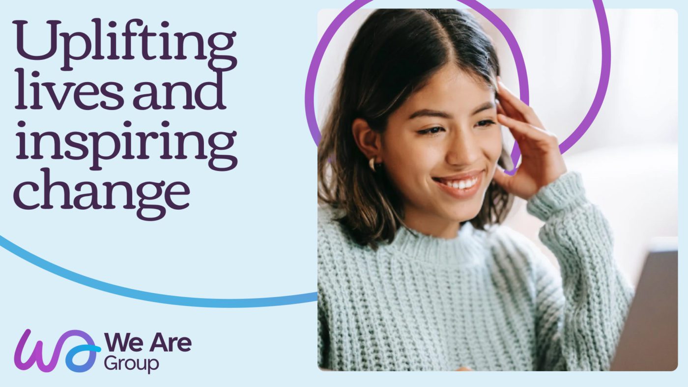
Warm & friendly typography with a rounded feel pairs with the connecting line, to give the brand a caring & human feel that’s contemporary & fresh.
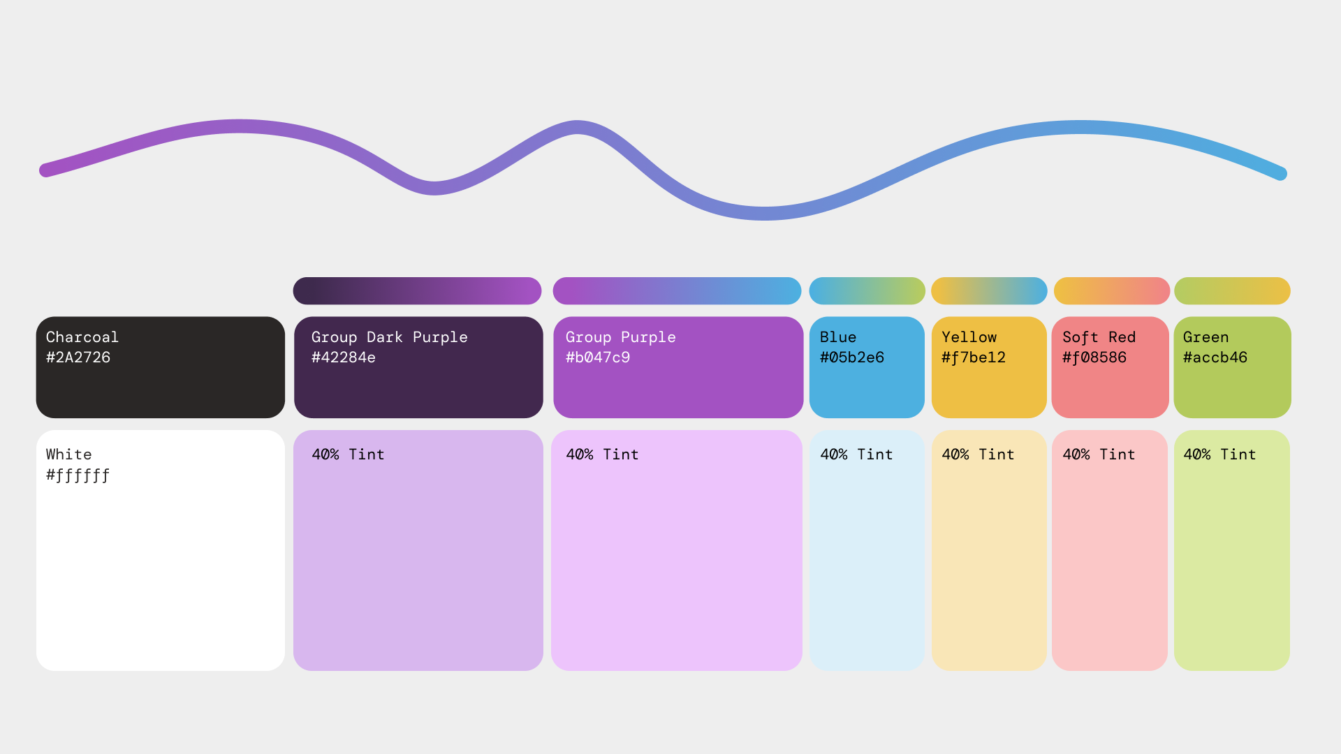
A colour palette of pastels and the gradient lines balances well with the strong purples that were retained to maintain a strong connection to the original brand.
Agency: Shape History
Role: Lead Designer
