Working with a leading landscape, art and architecture practice to help them visually communicate in a coherent new brand.
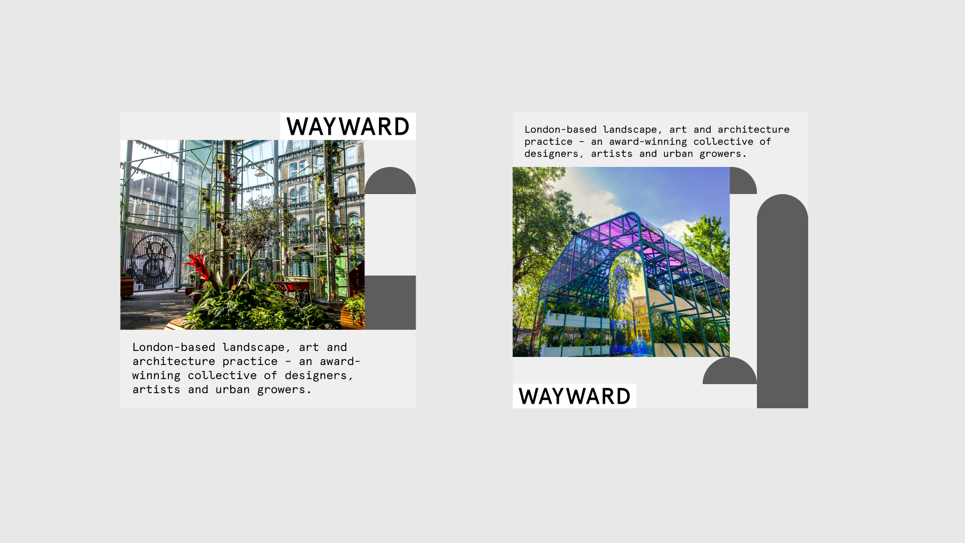
Wayward works with underutilised land and meanwhile spaces, transforming derelict sites into large-scale, design-driven spaces that engage local communities and inspire international audiences. They needed a new brand identity to better communicate and represent their work.
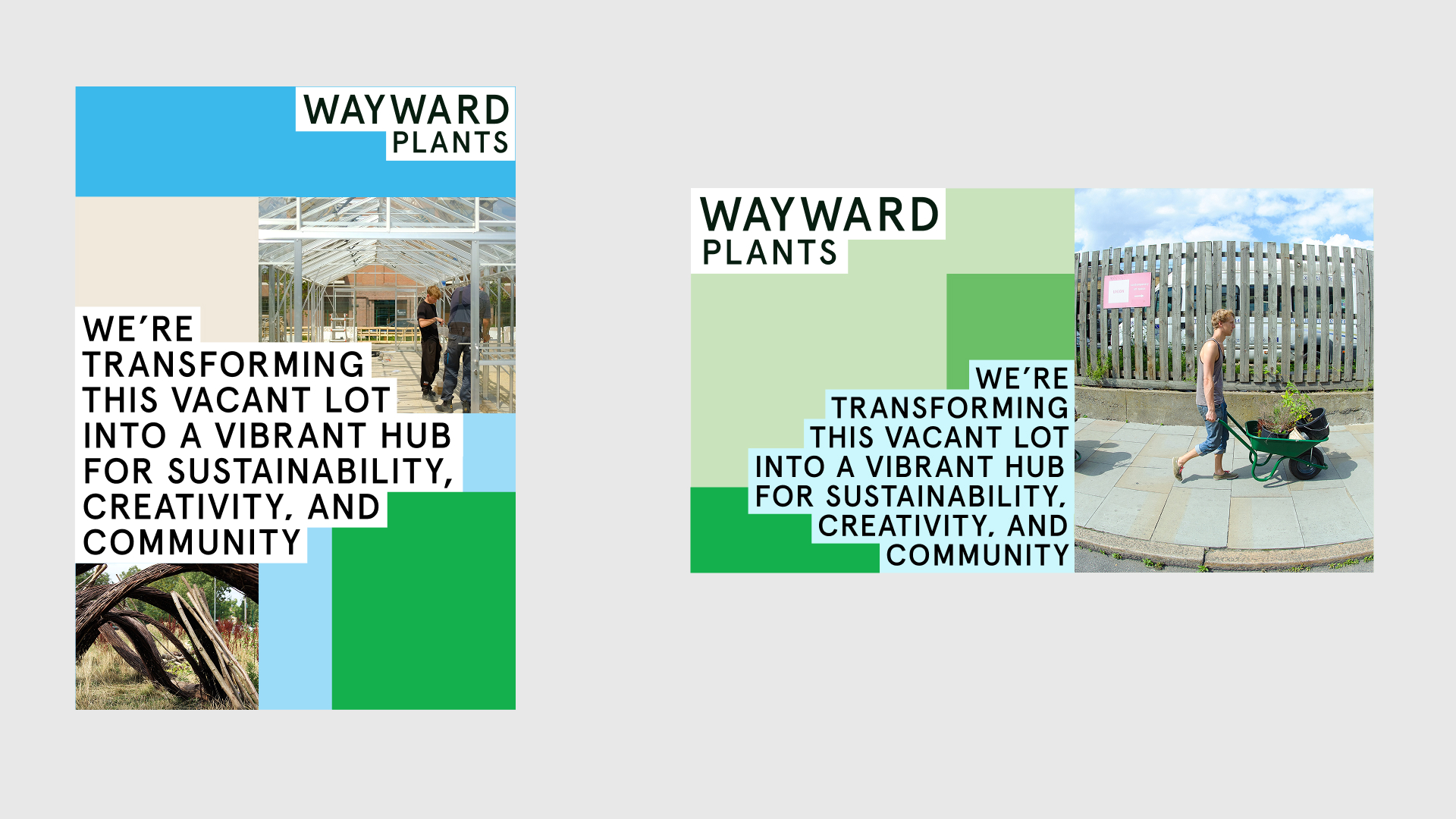
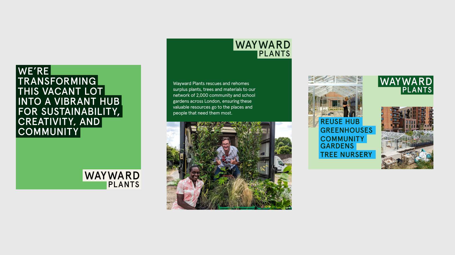
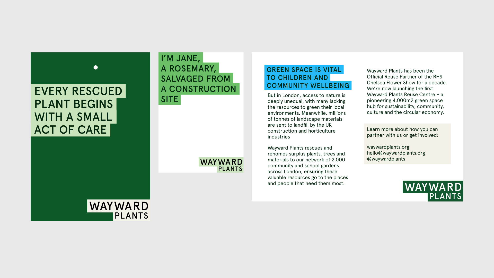
I worked closely with the team at Wayward to help develop and articulate a new brand for them and their off-shoot Wayward Plants. Including a new logo, visual language and approach to visual communication.
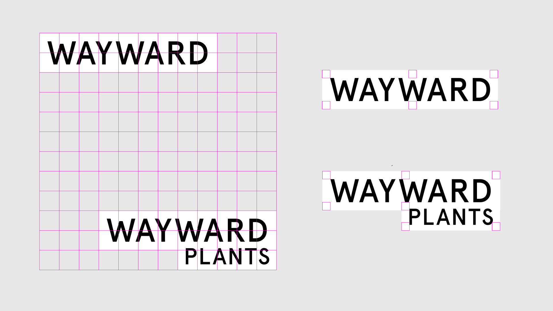
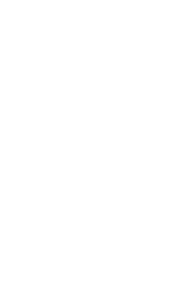
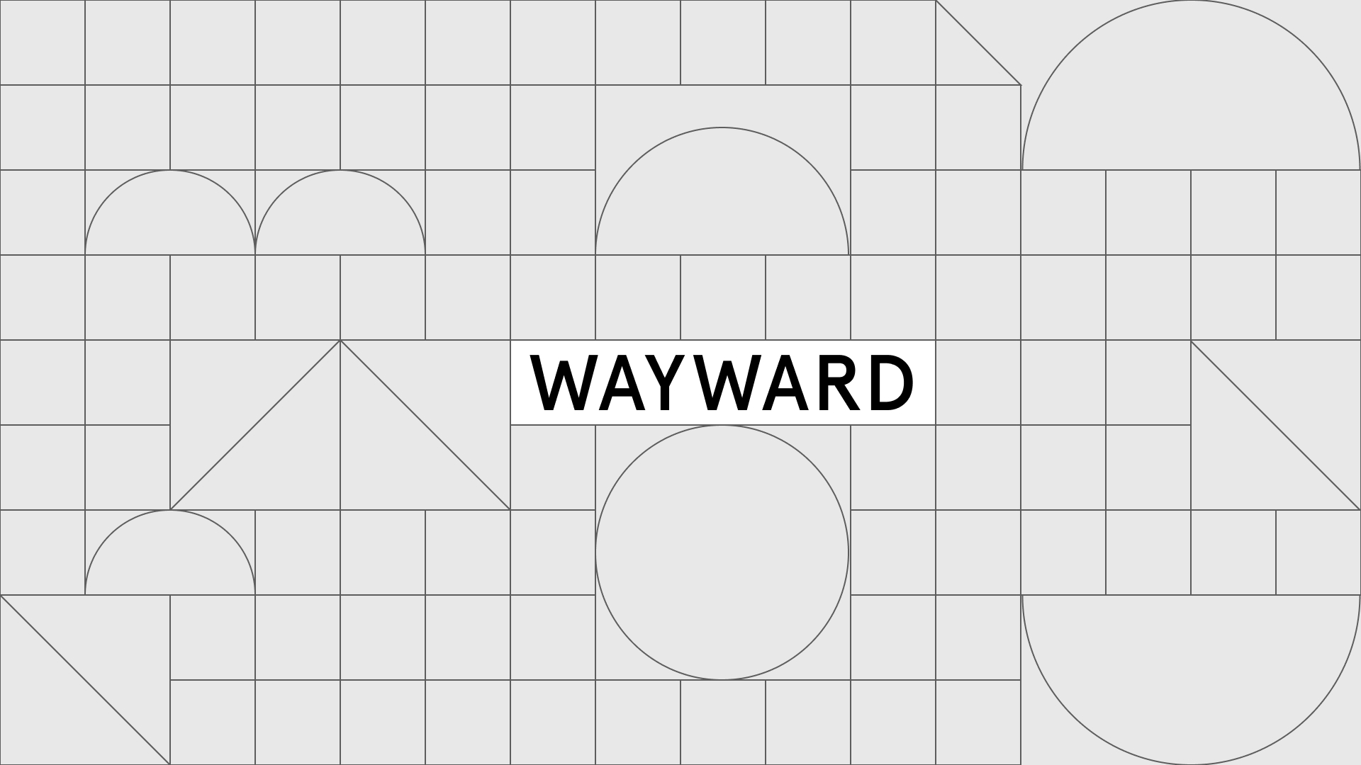
We arrived at a simple solution for the brand, with a close relationship between the logos for Wayward and Wayward Plants. Using a square grid to order and collect the brands helps maintain a relationship between to two, and helps inform a structure with which to order and layout content.
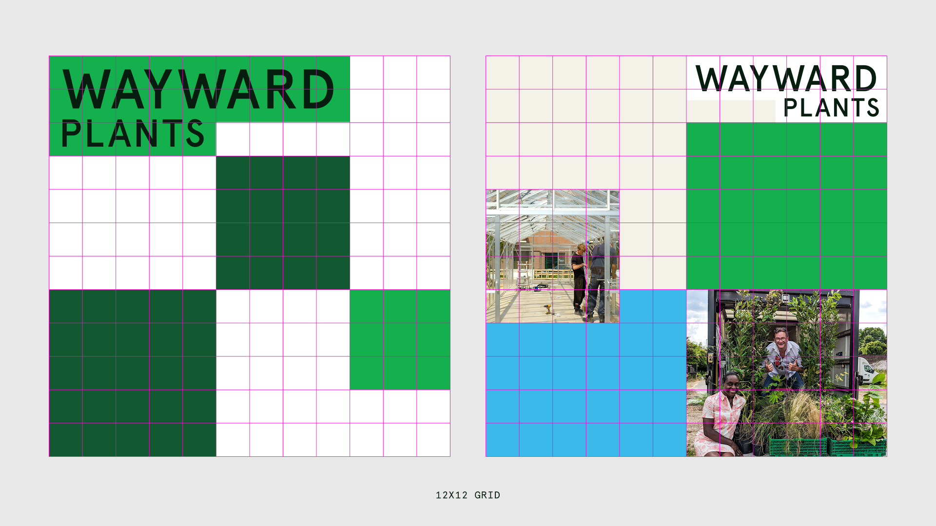
This grid runs through the Wayward Plants visual identity, helping anchor elements, providing structure and order. It adapts to different formats and helps maintain a consistency across work.
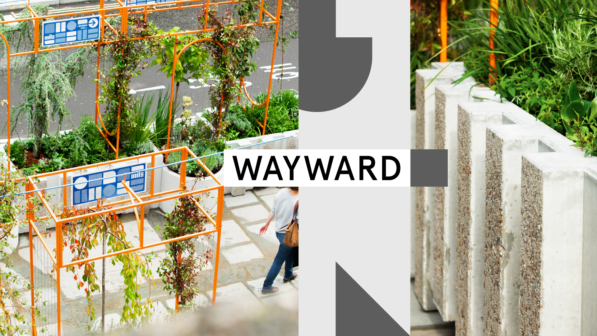
Typography, colour & photography help balance this order with energy and vibrancy, giving an architectural simplicity to the visual language.
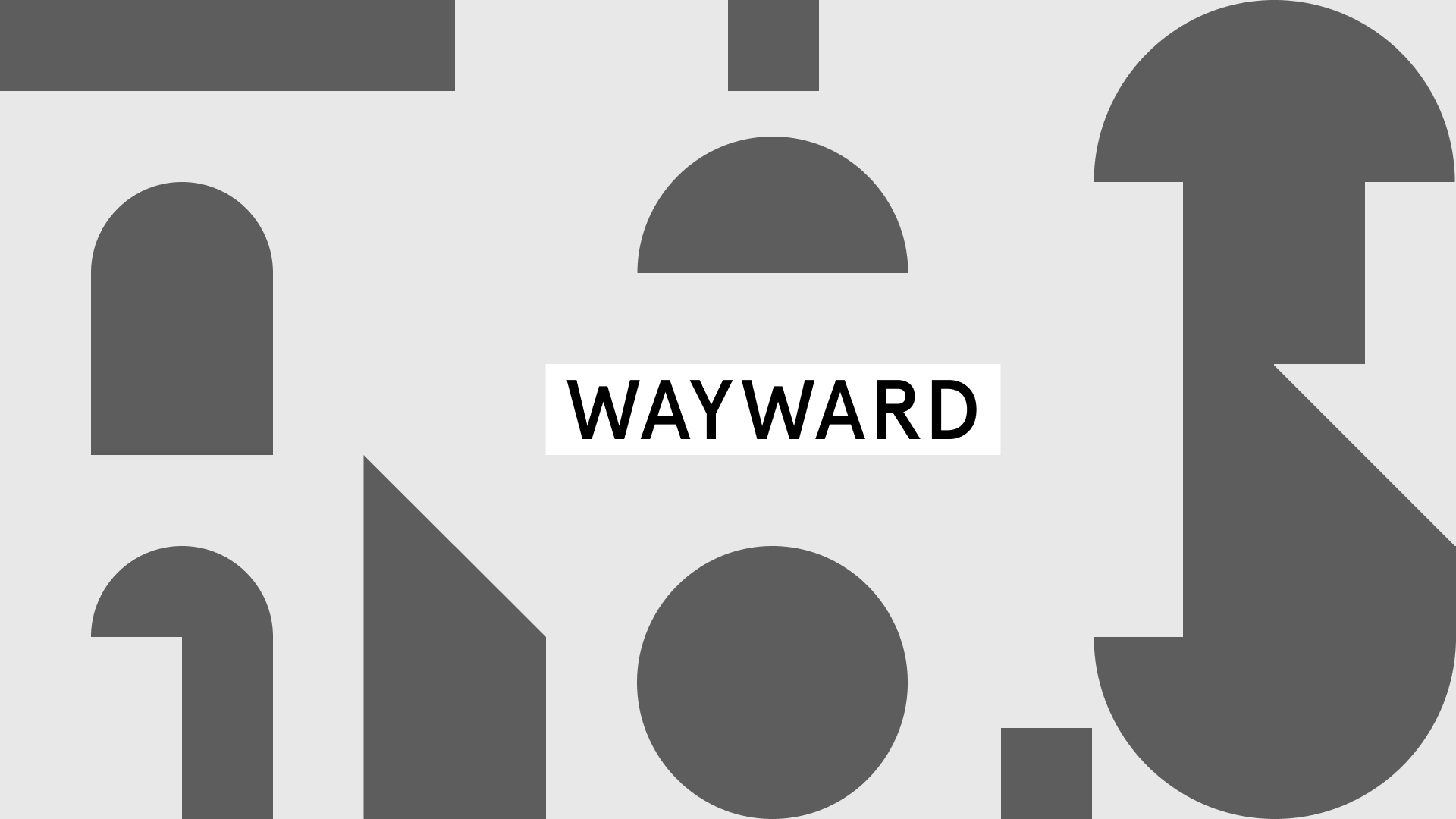
For Wayward the grid references the practice’s work directly, forming the same geometric forms that appear in their installations. Frames, arches and simple shapes run through the grid and can be used to add dynamism to simple layouts.
Work is ongoing with Wayward to support them with signage, print materials and more.